Graphics Devices in R

R version 4.0.0 (2020-04-24) -- "Arbor Day"
Copyright (C) 2020 The R Foundation for Statistical Computing
Platform: x86_64-w64-mingw32/x64 (64-bit)

R is free software and comes with ABSOLUTELY NO WARRANTY.
You are welcome to redistribute it under certain conditions.
Type 'license()' or 'licence()' for distribution details.

R is a collaborative project with many contributors.
Type 'contributors()' for more information and
'citation()' on how to cite R or R packages in publications.

Type 'demo()' for some demos, 'help()' for on-line help, or
'help.start()' for an HTML browser interface to help.
Type 'q()' to quit R.

setwd("C:/Users/kk/PortableApps/Git/home/k-allika/repos/DataScienceWithR/04_Exploratory_Data_Analysis/week01/workspace")
library(swirl)

| Hi! Type swirl() when you are ready to begin.

swirl()

| Welcome to swirl! Please sign in. If you've been here before, use the same name as you did
| then. If you are new, call yourself something unique.

What shall I call you? Krishnakanth Allika

| Please choose a course, or type 0 to exit swirl.

1: Exploratory Data Analysis
2: Take me to the swirl course repository!

Selection: 1

| Please choose a lesson, or type 0 to return to course menu.

1: Principles of Analytic Graphs 2: Exploratory Graphs
3: Graphics Devices in R 4: Plotting Systems
5: Base Plotting System 6: Lattice Plotting System
7: Working with Colors 8: GGPlot2 Part1
9: GGPlot2 Part2 10: GGPlot2 Extras
11: Hierarchical Clustering 12: K Means Clustering
13: Dimension Reduction 14: Clustering Example
15: CaseStudy

Selection: 3
| | 0%

| Graphics_Devices_in_R. (Slides for this and other Data Science courses may be found at
| github https://github.com/DataScienceSpecialization/courses/. If you care to use them,
| they must be downloaded as a zip file and viewed locally. This lesson corresponds to
| 04_ExploratoryAnalysis/Graphics_Devices_in_R.)

...

|== | 3%
| As the title suggests, this will be a short lesson introducing you to graphics devices in
| R. So, what IS a graphics device?

...

|===== | 6%
| Would you believe that it is something where you can make a plot appear, either a screen
| device, such as a window on your computer, OR a file device?

...

|======= | 9%
| There are several different kinds of file devices with particular characteristics and
| hence uses. These include PDF, PNG, JPEG, SVG, and TIFF. We'll talk more about these
| later.

...

|========== | 12%
| To be clear, when you make a plot in R, it has to be "sent" to a specific graphics device.
| Usually this is the screen (the default device), especially when you're doing exploratory
| work. You'll send your plots to files when you're ready to publish a report, make a
| presentation, or send info to colleagues.

...

|============ | 15%
| How you access your screen device depends on what computer system you're using. On a Mac
| the screen device is launched with the call quartz(), on Windows you use the call
| windows(), and on Unix/Linux x11(). On a given platform (Mac, Windows, Unix/Linux) there
| is only one screen device, and obviously not all graphics devices are available on all
| platforms (i.e. you cannot launch windows() on a Mac).

...

|=============== | 18%
| Run the R command ?Devices to see what graphics devices are available on your system.

?Devices

| That's correct!

|================= | 21%
| R Documentation shows you what's available.

...

|==================== | 24%
| There are two basic approaches to plotting. The first, plotting to the screen, is the most
| common. It's simple - you call a plotting function like plot, xyplot, or qplot (which you
| call depends on the plotting system you favor, but that's another lesson), so that the
| plot appears on the screen. Then you annotate (add to) the plot if necessary.

...

|====================== | 26%
| As an example, run the R command with with 2 arguments. The first is a dataset, faithful,
| which comes with R, and the second is a call to the base plotting function plot. Your call
| to plot should have two arguments, eruptions and waiting. Try this now to see what
| happens.

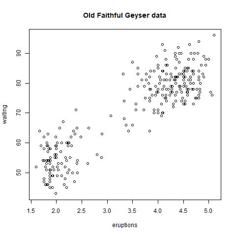
with(faithful,plot(eruptions,waiting))

graph

| Excellent job!

|======================== | 29%
| See how R created a scatterplot on the screen for you? This shows that relationship
| between eruptions of the geyser Old Faithful and waiting time. Now use the R function
| title with the argument main set equal to the string "Old Faithful Geyser data". This is
| an annotation to the plot.

title(main="Old Faithful Geyser data")

graph

| You are amazing!

|=========================== | 32%
| Simple, right? Now run the command dev.cur(). This will show you the current plotting
| device, the screen.

dev.cur()
RStudioGD
2

| That's the answer I was looking for.

|============================= | 35%
| The second way to create a plot is to send it to a file device. Depending on the type of
| plot you're making, you explicitly launch a graphics device, e.g., a pdf file. Type the
| command pdf(file="myplot.pdf") to launch the file device. This will create the pdf file
| myplot.pdf in your working directory.

pdf(file="myplot.pdf")

| Nice work!

|================================ | 38%
| You then call the plotting function (if you are using a file device, no plot will appear
| on the screen). Run the with command again to plot the Old Faithful data. Use the up arrow
| key to recover the command and save yourself some typing.

with(faithful,plot(eruptions,waiting))

| That's correct!

|================================== | 41%
| Now rerun the title command and annotate the plot. (Up arrow keys are great!)

title(main="Old Faithful Geyser data")

| You are doing so well!

|===================================== | 44%
| Finally, when plotting to a file device, you have to close the device with the command
| dev.off(). This is very important! Don't do it yet, though. After closing, you'll be able
| to view the pdf file on your computer.

...

|======================================= | 47%
| There are two basic types of file devices, vector and bitmap devices. These use different
| formats and have different characteristics. Vector formats are good for line drawings and
| plots with solid colors using a modest number of points, while bitmap formats are good for
| plots with a large number of points, natural scenes or web-based plots.

...

|========================================== | 50%
| We'll mention 4 specific vector formats. The first is pdf, which we've just used in our
| example. This is useful for line-type graphics and papers. It resizes well, is usually
| portable, but it is not efficient if a plot has many objects/points.

...

|============================================ | 53%
| The second is svg which is XML-based, scalable vector graphics. This supports animation
| and interactivity and is potentially useful for web-based plots.

...

|============================================== | 56%
| The last two vector formats are win.metafile, a Windows-only metafile format, and
| postscript (ps), an older format which also resizes well, is usually portable, and can be
| used to create encapsulated postscript files. Unfortunately, Windows systems often don’t
| have a postscript viewer.

...

|================================================= | 59%
| We'll also mention 4 different bitmap formats. The first is png (Portable Network
| Graphics) which is good for line drawings or images with solid colors. It uses lossless
| compression (like the old GIF format), and most web browsers can read this format
| natively. In addition, png is good for plots with many points, but it does not resize
| well.

...

|=================================================== | 62%
| In contrast, jpeg files are good for photographs or natural scenes. They use lossy
| compression, so they're good for plots with many points. Files in jpeg format don't resize
| well, but they can be read by almost any computer and any web browser. They're not great
| for line drawings.

...

|====================================================== | 65%
| The last two bitmap formats are tiff, an older lossless compression meta-format and bmp
| which is a native Windows bitmapped format.

...

|======================================================== | 68%
| Although it is possible to open multiple graphics devices (screen, file, or both), when
| viewing multiple plots at once, plotting can only occur on one graphics device at a time.

...

|=========================================================== | 71%
| The currently active graphics device can be found by calling dev.cur(). Try it now to see
| what number is assigned to your pdf device.

dev.cur()
pdf
4

| Your dedication is inspiring!

|============================================================= | 74%
| Now use dev.off() to close the device.

dev.off()
RStudioGD
2

View myplot.pdf

| You are quite good my friend!

|=============================================================== | 76%
| Now rerun dev.cur() to see what integer your plotting window is assigned.

dev.cur()
RStudioGD
2

| You got it!

|================================================================== | 79%
| The device is back to what it was when you started. As you might have guessed, every open
| graphics device is assigned an integer greater than or equal to 2. You can change the
| active graphics device with dev.set() where is the number associated
| with the graphics device you want to switch to.

...

|==================================================================== | 82%
| You can also copy a plot from one device to another. This can save you some time but
| beware! Copying a plot is not an exact operation, so the result may not be identical to
| the original. R provides some functions to help you do this. The function dev.copy copies
| a plot from one device to another, and dev.copy2pdf specifically copies a plot to a PDF
| file.

...

|======================================================================= | 85%
| Just for fun, rerun the with command again, with(faithful, plot(eruptions, waiting)), to
| plot the Old Faithful data. Use the up arrow key to recover the command if you don't feel
| like typing.

with(faithful,plot(eruptions,waiting))

| You are really on a roll!

|========================================================================= | 88%
| Now rerun the title command, title(main = "Old Faithful Geyser data"), to annotate the
| plot. (Up arrow keys are great!)

title(main="Old Faithful Geyser data")

| You are really on a roll!

|============================================================================ | 91%
| Now run dev.copy with the 2 arguments. The first is png, and the second is file set equal
| to "geyserplot.png". This will copy your screen plot to a png file in your working
| directory which you can view AFTER you close the device.

dev.copy(png,"geyserplot.png")
png
4

| Not quite, but you're learning! Try again. Or, type info() for more options.

| Type dev.copy(png, file = "geyserplot.png") at the command prompt.

dev.copy(png,file="geyserplot.png")
png
5

| That's correct!

|============================================================================== | 94%
| Don't forget to close the PNG device! Do it NOW!!! Then you'll be able to view the file.

dev.off()
RStudioGD
2

geyserplot.png

| Keep working like that and you'll get there!

|================================================================================= | 97%
| Congrats! We hope you found this lesson deviced well!

...

|===================================================================================| 100%
| Would you like to receive credit for completing this course on Coursera.org?

1: Yes
2: No

Selection: 1
What is your email address? xxxxxx@xxxxxxxxxxxx
What is your assignment token? xXxXxxXXxXxxXXXx
Grade submission succeeded!

| All that hard work is paying off!

| You've reached the end of this lesson! Returning to the main menu...

| Please choose a course, or type 0 to exit swirl.

1: Exploratory Data Analysis
2: Take me to the swirl course repository!

Selection: 0

| Leaving swirl now. Type swirl() to resume.

Last updated 2020-05-04 13:23:19.344014 IST

Exploratory Graphs

library(swirl)
swirl()

| Welcome to swirl! Please sign in. If you've been here before, use the same name as you did
| then. If you are new, call yourself something unique.

What shall I call you? Krishnakanth Allika

| Please choose a course, or type 0 to exit swirl.

1: Exploratory Data Analysis
2: Take me to the swirl course repository!

Selection: 1

| Please choose a lesson, or type 0 to return to course menu.

1: Principles of Analytic Graphs 2: Exploratory Graphs
3: Graphics Devices in R 4: Plotting Systems
5: Base Plotting System 6: Lattice Plotting System
7: Working with Colors 8: GGPlot2 Part1
9: GGPlot2 Part2 10: GGPlot2 Extras
11: Hierarchical Clustering 12: K Means Clustering
13: Dimension Reduction 14: Clustering Example
15: CaseStudy

Selection: 2
| | 0%

| Exploratory_Graphs. (Slides for this and other Data Science courses may be found at github
| https://github.com/DataScienceSpecialization/courses/. If you care to use them, they must
| be downloaded as a zip file and viewed locally. This lesson corresponds to
| 04_ExploratoryAnalysis/exploratoryGraphs.)

Error in (function (srcref) : unimplemented type (29) in 'eval'
Error: no more error handlers available (recursive errors?); invoking 'abort' restart
Error in readline("...") :
INTEGER() can only be applied to a 'integer', not a 'unknown type #29'
In addition: Warning message:
In readline("...") : type 29 is unimplemented in 'type2char'

| Leaving swirl now. Type swirl() to resume.

swirl()

| Welcome to swirl! Please sign in. If you've been here before, use the same name as you did
| then. If you are new, call yourself something unique.

What shall I call you? Krishnakanth Allika

| Would you like to continue with one of these lessons?

1: Exploratory Data Analysis Exploratory Graphs
2: No. Let me start something new.

Selection: 1

| Exploratory_Graphs. (Slides for this and other Data Science courses may be found at github
| https://github.com/DataScienceSpecialization/courses/. If you care to use them, they must
| be downloaded as a zip file and viewed locally. This lesson corresponds to
| 04_ExploratoryAnalysis/exploratoryGraphs.)

...

|= | 1%
| In this lesson, we'll discuss why graphics are an important tool for data scientists and
| the special role that exploratory graphs play in the field.

...

|== | 3%
| Which of the following would NOT be a good reason to use graphics in data science?

1: To understand data properties
2: To find a color that best matches the shirt you're wearing
3: To find patterns in data
4: To suggest modeling strategies

Selection: 2

| All that practice is paying off!

|=== | 4%
| So graphics give us some visual form of data, and since our brains are very good at seeing
| patterns, graphs give us a compact way to present data and find or display any pattern
| that may be present.

...

|==== | 5%
| Which of the following cliches captures the essence of graphics?

1: To err is human, to forgive divine
2: A rose by any other name smells as sweet
3: A picture is worth a 1000 words
4: The apple doesn't fall far from the tree

Selection: 3

| Excellent work!

|====== | 7%
| Exploratory graphs serve mostly the same functions as graphs. They help us find patterns
| in data and understand its properties. They suggest modeling strategies and help to debug
| analyses. We DON'T use exploratory graphs to communicate results.

...

|======= | 8%
| Instead, exploratory graphs are the initial step in an investigation, the "quick and
| dirty" tool used to point the data scientist in a fruitful direction. A scientist might
| need to make a lot of exploratory graphs in order to develop a personal understanding of
| the problem being studied. Plot details such as axes, legends, color and size are cleaned
| up later to convey more information in an aesthetically pleasing way.

...

|======== | 9%
| To demonstrate these ideas, we've copied some data for you from the U.S. Environmental
| Protection Agency (EPA) which sets national ambient air quality standards for outdoor air
| pollution. These Standards say that for fine particle pollution (PM2.5), the "annual mean,
| averaged over 3 years" cannot exceed 12 micro grams per cubic meter. We stored the data
| from the U.S. EPA web site in the data frame pollution. Use the R function head to see the
| first few entries of pollution.

head(pollution)
pm25 fips region longitude latitude
1 9.771185 01003 east -87.74826 30.59278
2 9.993817 01027 east -85.84286 33.26581
3 10.688618 01033 east -87.72596 34.73148
4 11.337424 01049 east -85.79892 34.45913
5 12.119764 01055 east -86.03212 34.01860
6 10.827805 01069 east -85.35039 31.18973

| You nailed it! Good job!

|========= | 11%
| We see right away that there's at least one county exceeding the EPA's standard of 12
| micrograms per cubic meter. What else do we see?

...

|========== | 12%
| We see 5 columns of data. The pollution count is in the first column labeled pm25. We'll
| work mostly with that. The other 4 columns are a fips code indicating the state (first 2
| digits) and county (last 3 digits) with that count, the associated region (east or west),
| and the longitude and latitude of the area. Now run the R command dim with pollution as an
| argument to see how long the table is.

dim(pollution)
[1] 576 5

| Great job!

|=========== | 13%
| So there are 576 entries in pollution. We'd like to investigate the question "Are there
| any counties in the U.S. that exceed that national standard (12 micro grams per cubic
| meter) for fine particle pollution?" We'll look at several one dimensional summaries of
| the data to investigate this question.

...

|============ | 15%
| The first technique uses the R command summary, a 5-number summary which returns 6
| numbers. Run it now with the pm25 column of pollution as its argument. Recall that the
| construct for this is pollution$pm25.

summary(pollution$pm25)
Min. 1st Qu. Median Mean 3rd Qu. Max.
3.383 8.549 10.047 9.836 11.356 18.441

| You are doing so well!

|============= | 16%
| This shows us basic info about the pm25 data, namely its Minimum (0 percentile) and
| Maximum (100 percentile) values, and three Quartiles of the data. These last indicate the
| pollution measures at which 25%, 50%, and 75% of the counties fall below. In addition to
| these 5 numbers we see the Mean or average measure of particulate pollution across the 576
| counties.

...

|============== | 17%
| Half the measured counties have a pollution level less than or equal to what number of
| micrograms per cubic meter?

1: 10.050
2: 9.836
3: 8.549
4: 11.360

Selection: 1

| You're the best!

|=============== | 19%
| To save you a lot of typing we've saved off pollution$pm25 for you in the variable ppm.
| You can use ppm now in place of the longer expression. Try it now as the argument of the R
| command quantile. See how the results look a lot like the results of the output of the
| summary command.

quantile(ppm)
0% 25% 50% 75% 100%
3.382626 8.548799 10.046697 11.356012 18.440731

| All that hard work is paying off!

|================= | 20%
| See how the results are similar to those returned by summary? Quantile gives the
| quartiles, right? What is the one value missing from this quantile output that summary
| gave you?

1: the maximum value
2: the median
3: the minimum value
4: the mean

Selection: 4

| Excellent work!

|================== | 21%
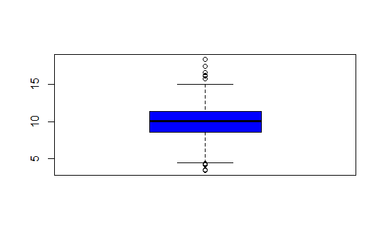
| Now we'll plot a picture, specifically a boxplot. Run the R command boxplot with ppm as an
| input. Also specify the color parameter col equal to "blue".

boxplot(ppm,col="blue")

graph

| That's a job well done!

|=================== | 23%
| The boxplot shows us the same quartile data that summary and quantile did. The lower and
| upper edges of the blue box respectively show the values of the 25% and 75% quantiles.

...

|==================== | 24%
| What do you think the horizontal line inside the box represents?

1: the maximum value
2: the mean
3: the minimum value
4: the median

Selection: 4

| Nice work!

|===================== | 25%
| The "whiskers" of the box (the vertical lines extending above and below the box) relate to
| the range parameter of boxplot, which we let default to the value 1.5 used by R. The
| height of the box is the interquartile range, the difference between the 75th and 25th
| quantiles. In this case that difference is 2.8. The whiskers are drawn to be a length of
| range2.8 or 1.52.8. This shows us roughly how many, if any, data points are outliers,
| that is, beyond this range of values.

...

|====================== | 27%
| Note that boxplot is part of R's base plotting package. A nice feature that this package
| provides is its ability to overlay features. That is, you can add to (annotate) an
| existing plot.

...

|======================= | 28%
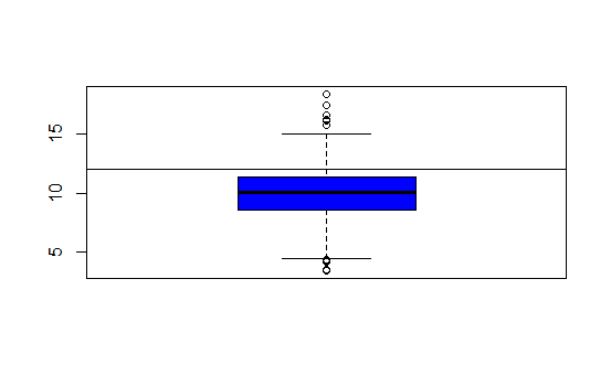
| To see this, run the R command abline with the argument h equal to 12. Recall that 12 is
| the EPA standard for air quality.

abline(h=12)

graph

| That's a job well done!

|======================== | 29%
| What do you think this command did?

1: drew a horizontal line at 12
2: hid 12 random data points
3: drew a vertical line at 12
4: nothing

Selection: 1

| Keep up the great work!

|========================= | 31%
| So abline "adds one or more straight lines through the current plot." We see from the plot
| that the bulk of the measured counties comply with the standard since they fall under the
| line marking that standard.

...

|=========================== | 32%
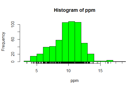
| Now use the R command hist (another function from the base package) with the argument ppm.
| Specify the color parameter col equal to "green". This will plot a histogram of the data.

hist(ppm,col="green")

graph

| You nailed it! Good job!

|============================ | 33%
| The histogram gives us a little more detailed information about our data, specifically the
| distribution of the pollution counts, or how many counties fall into each bucket of
| measurements.

...

|============================= | 35%
| What are the most frequent pollution counts?

1: between 9 and 12
2: between 12 and 14
3: between 6 and 8
4: under 5

Selection: 1

| You're the best!

|============================== | 36%
| Now run the R command rug with the argument ppm.

rug(ppm)

graph

| That's correct!

|=============================== | 37%
| This one-dimensional plot, with its grayscale representation, gives you a little more
| detailed information about how many data points are in each bucket and where they lie
| within the bucket. It shows (through density of tick marks) that the greatest
| concentration of counties has between 9 and 12 micrograms per cubic meter just as the
| histogram did.

...

|================================ | 39%
| To illustrate this a little more, we've defined for you two vectors, high and low,
| containing pollution data of high (greater than 15) and low (less than 5) values
| respectively. Look at low now and see how it relates to the output of rug.

low
[1] 3.494351 4.186090 4.917140 4.504539 4.793644 4.601408 4.195688 4.625279 4.460193
[10] 4.978397 4.324736 4.175901 3.382626 4.132739 4.955570 4.565808

| All that hard work is paying off!

|================================= | 40%
| It confirms that there are two data points between 3 and 4 and many between 4 and 5. Now
| look at high.

high
[1] 16.19452 15.80378 18.44073 16.66180 15.01573 17.42905 16.25190 16.18358

| Excellent job!

|================================== | 41%
| Again, we see one data point greater than 18, one between 17 and 18, several between 16
| and 17 and two between 15 and 16, verifying what rug indicated.

...

|=================================== | 43%
| Now rerun hist with 3 arguments, ppm as its first, col equal to "green", and the argument
| breaks equal to 100.

hist(ppm,col="green",breaks=100)

graph

| All that practice is paying off!

|===================================== | 44%
| What do you think the breaks argument specifies in this case?

1: the number of data points to graph
2: the number of counties exceeding the EPA standard
3: the number of buckets to split the data into
4: the number of stars in the sky

Selection: 3

| You are amazing!

|====================================== | 45%
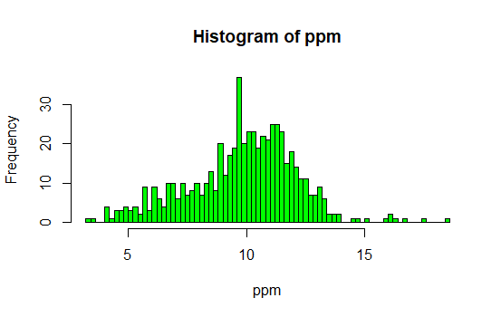
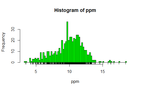
| So this histogram with more buckets is not nearly as smooth as the preceding one. In fact,
| it's a little too noisy to see the distribution clearly. When you're plotting histograms
| you might have to experiment with the argument breaks to get a good idea of your data's
| distribution. For fun now, rerun the R command rug with the argument ppm.

rug(ppm)

graph

| That's a job well done!

|======================================= | 47%
| See how rug works with the existing plot? It automatically adjusted its pocket size to
| that of the last plot plotted.

...

|======================================== | 48%
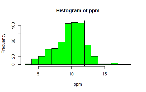
| Now rerun hist with ppm as the data and col equal to "green".

hist(ppm,col="green")

graph

| Great job!

|========================================= | 49%
| Now run the command abline with the argument v equal to 12 and the argument lwd equal to
| 2.

abline(v=12,lwd=2)

graph

| You are doing so well!

|========================================== | 51%
| See the vertical line at 12? Not very visible, is it, even though you specified a line
| width of 2? Run abline with the argument v equal to median(ppm), the argument col equal to
| "magenta", and the argument lwd equal to 4.

abline(v=median(ppm),col="magenta",lwd=4)

graph

| You are quite good my friend!

|=========================================== | 52%
| Better, right? Thicker and more of a contrast in color. This shows that although the
| median (50%) is below the standard, there are a fair number of counties in the U.S that
| have pollution levels higher than the standard.

...

|============================================ | 53%
| Now recall that our pollution data had 5 columns of information. So far we've only looked
| at the pm25 column. We can also look at other information. To remind yourself what's there
| run the R command names with pollution as the argument.

names(pollution)
[1] "pm25" "fips" "region" "longitude" "latitude"

| Keep up the great work!

|============================================= | 55%
| Longitude and latitude don't sound interesting, and each fips is unique since it
| identifies states (first 2 digits) and counties (last 3 digits). Let's look at the region
| column to see what's there. Run the R command table on this column. Use the construct
| pollution$region. Store the result in the variable reg.

reg<-table(pollution$region)

| All that practice is paying off!

|============================================== | 56%
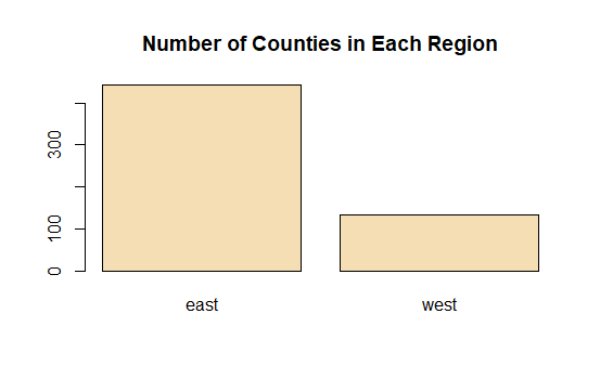
| Look at reg now.

reg

east west
442 134

| Nice work!

|================================================ | 57%
| Lot more counties in the east than west. We'll use the R command barplot (another type of
| one-dimensional summary) to plot this information. Call barplot with reg as its first
| argument, the argument col equal to "wheat", and the argument main equal to the string
| "Number of Counties in Each Region".

barplot(reg,col="wheat",main="Number of Counties in Each Region")

graph

| You are quite good my friend!

|================================================= | 59%
| What do you think the argument main specifies?

1: the y axis label
2: the title of the graph
3: the x axis label
4: I can't tell

Selection: 2

| You are doing so well!

|================================================== | 60%
| So we've seen several examples of one-dimensional graphs that summarize data. Two
| dimensional graphs include scatterplots, multiple graphs which we'll see more examples of,
| and overlayed one-dimensional plots which the R packages such as lattice and ggplot2
| provide.

...

|=================================================== | 61%
| Some graphs have more than two-dimensions. These include overlayed or multiple
| two-dimensional plots and spinning plots. Some three-dimensional plots are tricky to
| understand so have limited applications. We'll see some examples now of more complicated
| graphs, in particular, we'll show two graphs together.

...

|==================================================== | 63%
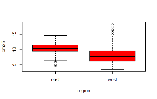
| First we'll show how R, in one line and using base plotting, can display multiple
| boxplots. We simply specify that we want to see the pollution data as a function of
| region. We know that our pollution data characterized each of the 576 entries as belonging
| to one of two regions (east and west).

...

|===================================================== | 64%
| We use the R formula y ~ x to show that y (in this case pm25) depends on x (region). Since
| both come from the same data frame (pollution) we can specify a data argument set equal to
| pollution. By doing this, we don't have to type pollution$pm25 (or ppm) and | pollution$region. We can just specify the formula pm25~region. Call boxplot now with this
| formula as its argument, data equal to pollution, and col equal to "red".

boxplot(pm25~region,data=pollution,col="red")

graph

| Perseverance, that's the answer.

|====================================================== | 65%
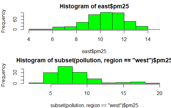
| Two for the price of one! Similarly we can plot multiple histograms in one plot, though to
| do this we have to use more than one R command. First we have to set up the plot window
| with the R command par which specifies how we want to lay out the plots, say one above the
| other. We also use par to specify margins, a 4-long vector which indicates the number of
| lines for the bottom, left, top and right. Type the R command
| par(mfrow=c(2,1),mar=c(4,4,2,1)) now. Don't expect to see any new result.

par(mfrow=c(2,1),mar=c(4,4,2,1))

| That's a job well done!

|======================================================= | 67%
| So we set up the plot window for two rows and one column with the mfrow argument. The mar
| argument set up the margins. Before we plot the histograms let's explore the R command
| subset which, not surprisingly, "returns subsets of vectors, matrices or data frames which
| meet conditions". We'll use subset to pull off the data we want to plot. Call subset now
| with pollution as its first argument and a boolean expression testing region for equality
| with the string "east". Put the result in the variable east.

east<-subset(pollution,region=="east")

| Keep working like that and you'll get there!

|======================================================== | 68%
| Use head to look at the first few entries of east.

head(east)
pm25 fips region longitude latitude
1 9.771185 01003 east -87.74826 30.59278
2 9.993817 01027 east -85.84286 33.26581
3 10.688618 01033 east -87.72596 34.73148
4 11.337424 01049 east -85.79892 34.45913
5 12.119764 01055 east -86.03212 34.01860
6 10.827805 01069 east -85.35039 31.18973

| Excellent work!

|========================================================== | 69%
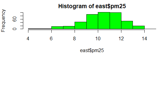
| So east holds more information than we need. We just want to plot a histogram with the
| pm25 portion. Call hist now with the pm25 portion of east as its first argument and col
| equal to "green" as its second.

hist(east$pm25,col="green")

graph

| You got it!

|=========================================================== | 71%
| See? The command par told R we were going to have one column with 2 rows, so it placed
| this histogram in the top position.

...

|============================================================ | 72%
| Now, here's a challenge for you. Plot the histogram of the counties from the west using
| just one R command. Let the appropriate subset command (with the pm25 portion specified)
| be the first argument and col (equal to "green") the second. To cut down on your typing,
| use the up arrow key to get your last command and replace "east" with the subset command.
| Make sure the boolean argument checks for equality between region and "west".

hist(subset(pollution,region=="west")$pm25,col="green")

graph

| You are really on a roll!

|============================================================= | 73%
| See how R does all the labeling for you? Notice that the titles are different since we
| used different commands for the two plots. Let's look at some scatter plots now.

...

|============================================================== | 75%
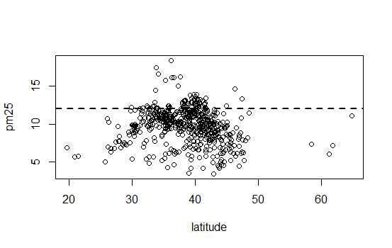
| Scatter plots are two-dimensional plots which show the relationship between two variables,
| usually x and y. Let's look at a scatterplot showing the relationship between latitude and
| the pm25 data. We'll use plot, a function from R's base plotting package.

...

|=============================================================== | 76%
| We've seen that we can use a function call as an argument when calling another function.
| We'll do this again when we call plot with the arguments latitude and pm25 which are both
| from our data frame pollution. We'll call plot from inside the R command with which
| evaluates "an R expression in an environment constructed from data". We'll use pollution
| as the first argument to with and the call to plot as the second. This allows us to avoid
| typing "pollution$" before the arguments to plot, so it saves us some typing and adds to
| your base of R knowledge. Try this now.

with(pollution,plot(latitude,pm25))

graph

| You nailed it! Good job!

|================================================================ | 77%
| Note that the first argument is plotted along the x-axis and the second along the y. Now
| use abline to add a horizontal line at 12. Use two additional arguments, lwd equal to 2
| and lty also equal to 2. See what happens.

abline(h=12,lwd=2,lty=2)

graph

| That's correct!

|================================================================= | 79%
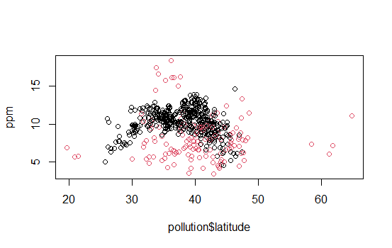
| See how lty=2 made the line dashed? Now let's replot the scatterplot. This time, instead
| of using with, call plot directly with 3 arguments. The first 2 are pollution$latitude and | ppm. The third argument, col, we'll use to add color and more information to our plot. Set | this argument (col) equal to pollution$region and see what happens.

plot(pollution$latitude,ppm,col=pollution$region)

graph

| Perseverance, that's the answer.

|================================================================== | 80%
| We've got two colors on the map to distinguish between counties in the east and those in
| the west. Can we figure out which color is east and which west? See that the high (greater
| than 50) and low (less than 25) latitudes are both red. Latitudes indicate distance from
| the equator, so which half of the U.S. (east or west) has counties at the extreme north
| and south?

1: east
2: west

Selection: 2

| That's a job well done!

|==================================================================== | 81%
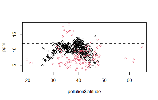
| As before, use abline to add a horizontal line at 12. Use two additional arguments, lwd
| equal to 2 and lty also equal to 2.

abline(h=12,lwd=2,lty=2)

graph

| You are amazing!

|===================================================================== | 83%
| We see many counties are above the healthy standard set by the EPA, but it's hard to tell
| overall, which region, east or west, is worse.

...

|====================================================================== | 84%
| Let's plot two scatterplots distinguished by region.

...

|======================================================================= | 85%
| As we did with multiple histograms, we first have to set up the plot window with the R
| command par. This time, let's plot the scatterplots side by side (one row and two
| columns). We also need to use different margins. Type the R command par(mfrow = c(1, 2),
| mar = c(5, 4, 2, 1)) now. Don't expect to see any new result.

par(mfrow = c(1, 2),mar = c(5, 4, 2, 1))

| You are quite good my friend!

|======================================================================== | 87%
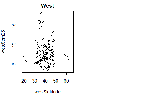
| For the first scatterplot, on the left, we'll plot the latitudes and pm25 counts from the
| west. We already pulled out the information for the counties in the east. Let's now get
| the information for the counties from the west. Create the variable west by using the
| subset command with pollution as the first argument and the appropriate boolean as the
| second.

west<-subset(pollution,region="west")

| Keep trying! Or, type info() for more options.

| Type west <- subset(pollution,region=="west") at the command prompt.

west<-subset(pollution,region=="west")

| That's the answer I was looking for.

|========================================================================= | 88%
| Now call plot with three arguments. These are west$latitude (x-axis), west$pm25 (y-axis),
| and the argument main equal to the string "West" (title). Do this now.

plot(west$latitude,west$pm25,main="West")

graph

| You are really on a roll!

|========================================================================== | 89%
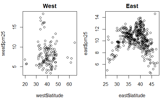
| For the second scatterplot, on the right, we'll plot the latitudes and pm25 counts from
| the east.

...

|=========================================================================== | 91%
| As before, use the up arrow key and change the 3 "West" strings to "East".

plot(east$latitude,east$pm25,main="East")

graph

| You're the best!

|============================================================================ | 92%
| See how R took care of all the details for you? Nice, right? It looks like there are more
| dirty counties in the east but the extreme dirt (greater than 15) is in the west.

...

|============================================================================= | 93%
| Let's summarize and review.

...

|=============================================================================== | 95%
| Which of the following characterizes exploratory plots?

1: quick and dead
2: slow and clean
3: quick and dirty
4: slow and steady

Selection: 3

| That's the answer I was looking for.

|================================================================================ | 96%
| True or false? Plots let you summarize the data (usually graphically) and highlight any
| broad features

1: False
2: True

Selection: 2

| You are amazing!

|================================================================================= | 97%
| Which of the following do plots NOT do?

1: Explore basic questions and hypotheses (and perhaps rule them out)
2: Conclude that you are ALWAYS right
3: Suggest modeling strategies for the "next step"
4: Summarize the data (usually graphically) and highlight any broad features

Selection: 2

| That's a job well done!

|================================================================================== | 99%
| Congrats! You've concluded exploring this lesson on graphics. We hope you didn't find it
| too quick or dirty.

...

|===================================================================================| 100%
| Would you like to receive credit for completing this course on Coursera.org?

1: Yes
2: No

Selection: 2

| Excellent job!

| You've reached the end of this lesson! Returning to the main menu...

| Please choose a course, or type 0 to exit swirl.

1: Exploratory Data Analysis
2: Take me to the swirl course repository!

Selection: 0

| Leaving swirl now. Type swirl() to resume.

rm(list=ls())

Last updated 2020-05-02 19:17:35.849963 IST

Principles of Analytic Graphs

R version 4.0.0 (2020-04-24) -- "Arbor Day"
Copyright (C) 2020 The R Foundation for Statistical Computing
Platform: x86_64-w64-mingw32/x64 (64-bit)

R is free software and comes with ABSOLUTELY NO WARRANTY.
You are welcome to redistribute it under certain conditions.
Type 'license()' or 'licence()' for distribution details.

R is a collaborative project with many contributors.
Type 'contributors()' for more information and
'citation()' on how to cite R or R packages in publications.

Type 'demo()' for some demos, 'help()' for on-line help, or
'help.start()' for an HTML browser interface to help.
Type 'q()' to quit R.

[Workspace loaded from C:/Users/kk/PortableApps/Git/home/k-allika/repos/DataScienceWithR/.RData]

setwd("C:/Users/kk/PortableApps/Git/home/k-allika/repos/DataScienceWithR/04_Exploratory_Data_Analysis/week01/workspace")
library(swirl)

| Hi! I see that you have some variables saved in your workspace. To keep things running
| smoothly, I recommend you clean up before starting swirl.

| Type ls() to see a list of the variables in your workspace. Then, type rm(list=ls()) to
| clear your workspace.

| Type swirl() when you are ready to begin.

swirl()

| Welcome to swirl! Please sign in. If you've been here before, use the same name as you did
| then. If you are new, call yourself something unique.

What shall I call you? Krishnakanth Allika

| Please choose a course, or type 0 to exit swirl.

1: Exploratory Data Analysis
2: Getting and Cleaning Data
3: R Programming
4: Take me to the swirl course repository!

Selection: 1

| Please choose a lesson, or type 0 to return to course menu.

1: Principles of Analytic Graphs 2: Exploratory Graphs
3: Graphics Devices in R 4: Plotting Systems
5: Base Plotting System 6: Lattice Plotting System
7: Working with Colors 8: GGPlot2 Part1
9: GGPlot2 Part2 10: GGPlot2 Extras
11: Hierarchical Clustering 12: K Means Clustering
13: Dimension Reduction 14: Clustering Example
15: CaseStudy

Selection: 1

| Attempting to load lesson dependencies...

| Package ‘jpeg’ loaded correctly!

| | 0%

| Principles_of_Analytic_Graphs. (Slides for this and other Data Science courses may be
| found at github https://github.com/DataScienceSpecialization/courses/. If you care to use
| them, they must be downloaded as a zip file and viewed locally. This lesson corresponds to
| 04_ExploratoryAnalysis/Principles_of_Analytic_Graphics.)

...

|== | 3%
| In this lesson, we'll discuss some basic principles of presenting data effectively. These
| will illustrate some fundamental concepts of displaying results in order to make them more
| meaningful and convincing. These principles are cribbed from Edward Tufte's great 2006
| book, Beautiful Evidence. You can read more about them at the www.edwardtufte.com website.

...

|===== | 6%
| As a warm-up, which of the following would NOT be a good use of analytic graphing?

1: To show causality, mechanism, explanation
2: To show multivariate data
3: To decide which horse to bet on at the track
4: To show comparisons

Selection: 3

| Keep up the great work!

|======= | 8%
| You're ready to start. Graphs give us a visual form of data, and the first principle of
| analytic graphs is to show some comparison. You'll hear more about this when you study
| statistical inference (another great course BTW), but evidence for a hypothesis is always
| relative to another competing or alternative hypothesis.

...

|========= | 11%
| When presented with a claim that something is good, you should always ask "Compared to
| What?" This is why in commercials you often hear the phrase "other leading brands". An
| implicit comparison, right?

...

|============ | 14%
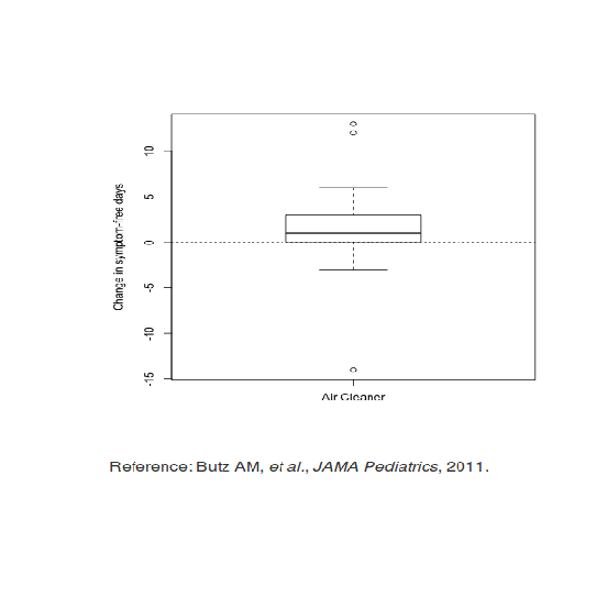
| Consider this boxplot which shows the relationship between the use of an air cleaner and
| the number of symptom-free days of asthmatic children. (The top and bottom lines of the
| box indicate the 25% and 75% quartiles of the data, and the horizontal line in the box
| shows the 50%.) Since the box is above 0, the number of symptom-free days for children
| with asthma is bigger using the air cleaner. This is good, right?

...

graph

|============== | 17%
| How many days of improvement does the median correspond to?

1: 4
2: -2
3: 1
4: 12

Selection: 3

| That's correct!

|================ | 19%
| While it's somewhat informative, it's also somewhat cryptic, since the y-axis is claiming
| to show a change in number of symptom-free days. Wouldn't it be better to show a
| comparison?

...

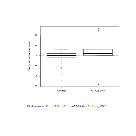
|================== | 22%
| Like this? Here's a graphic which shows two boxplots, the one on the left showing the
| results for a control group that doesn't use an air cleaner alongside the previously shown
| boxplot.

...

|===================== | 25%
| By showing the two boxplots side by side, you can clearly see that using the air cleaner
| increases the number of symptom-free days for most asthmatic children. The plot on the
| right (using the air cleaner) is generally higher than the one on the left (the control
| group).

...

graph

|======================= | 28%
| What does this graph NOT show you?

1: Half the chidren in the control group had no improvement
2: Children in the control group had at most 3 symptom-free days
3: 75% of the children using the air cleaner had at most 3 symptom-free days
4: Using the air cleaner makes asthmatic children sicker

Selection: 4

| You're the best!

|========================= | 31%
| So the first principle was to show a comparison. The second principle is to show causality
| or a mechanism of how your theory of the data works. This explanation or systematic
| structure shows your causal framework for thinking about the question you're trying to
| answer.

...

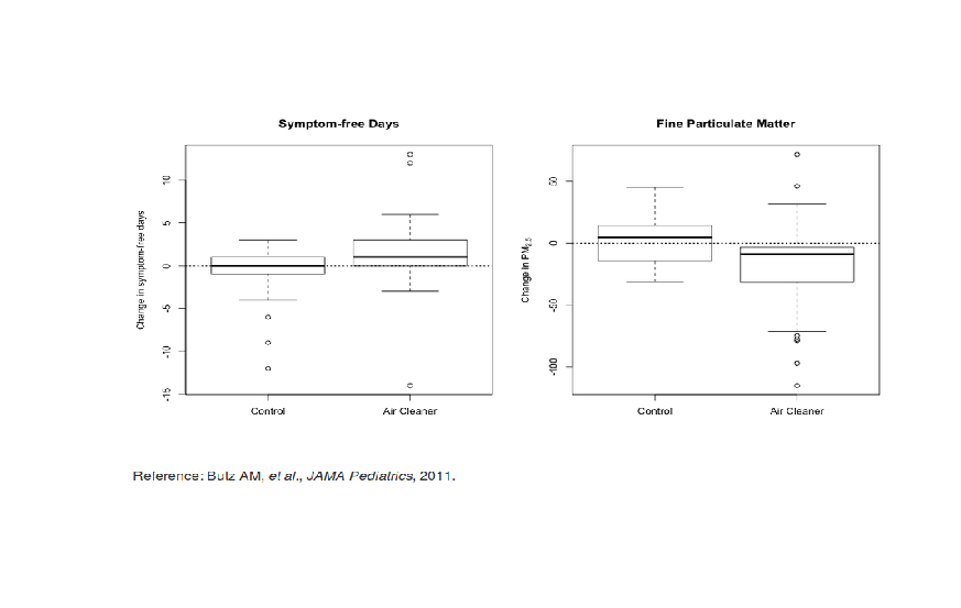
|============================ | 33%
| Consider this plot which shows the dual boxplot we just showed, but next to it we have a
| corresponding plot of changes in measures of particulate matter.

...

graph

|============================== | 36%
| This picture tries to explain how the air cleaner increases the number of symptom-free
| days for asthmatic children. What mechanism does the graph imply?

1: That the air cleaner increases pollution
2: That the air cleaner reduces pollution
3: That the children in the control group are healthier
4: That the air in the control group is cleaner than the air in the other group

Selection: 2

| You are amazing!

|================================ | 39%
| By showing the two sets of boxplots side by side you're explaining your theory of why the
| air cleaner increases the number of symptom-free days. Onward!

...

|=================================== | 42%
| So the first principle was to show some comparison, the second was to show a mechanism, so
| what will the third principle say to show?

...

|===================================== | 44%
| Multivariate data!

...

|======================================= | 47%
| What is multivariate data you might ask? In technical (scientific) literature this term
| means more than 2 variables. Two-variable plots are what you saw in high school algebra.
| Remember those x,y plots when you were learning about slopes and intercepts and equations
| of lines? They're valuable, but usually questions are more complicated and require more
| variables.

...

|========================================== | 50%
| Sometimes, if you restrict yourself to two variables you'll be misled and draw an
| incorrect conclusion.

...

|============================================ | 53%
| Consider this plot which shows the relationship between air pollution (x-axis) and
| mortality rates among the elderly (y-axis). The blue regression line shows a surprising
| result. (You'll learn about regression lines when you take the fabulous Regression Models
| course.)

...

graph

|============================================== | 56%
| What does the blue regression line indicate?

1: Pollution doesn't really increase, it just gets reported more
2: As pollution increases fewer people die
3: As pollution increases the number of deaths doesn't change
4: As pollution increases more people die

Selection: 2

| Excellent job!

|================================================ | 58%
| Fewer deaths with more pollution? That's a surprise! Something's gotta be wrong, right? In
| fact, this is an example of Simpson's paradox, or the Yule–Simpson effect. Wikipedia
| (http://en.wikipedia.org/wiki/Simpson%27s_paradox) tells us that this "is a paradox in
| probability and statistics, in which a trend that appears in different groups of data
| disappears when these groups are combined."

...

|=================================================== | 61%
| Suppose we divided this mortality/pollution data into the four seasons. Would we see
| different trends?

...

|===================================================== | 64%
| Yes, we do! Plotting the same data for the 4 seasons individually we see a different
| result.

...

graph

|======================================================= | 67%
| What does the new plot indicate?

1: Pollution doesn't really increase, it just gets reported more
2: As pollution increases the seasons change
3: As pollution increases more people die in all seasons
4: As pollution increases fewer people die in all seasons

Selection: 3

| That's correct!

|========================================================== | 69%
| The fourth principle of analytic graphing involves integrating evidence. This means not
| limiting yourself to one form of expression. You can use words, numbers, images as well as
| diagrams. Graphics should make use of many modes of data presentation. Remember, "Don't
| let the tool drive the analysis!"

...

|============================================================ | 72%
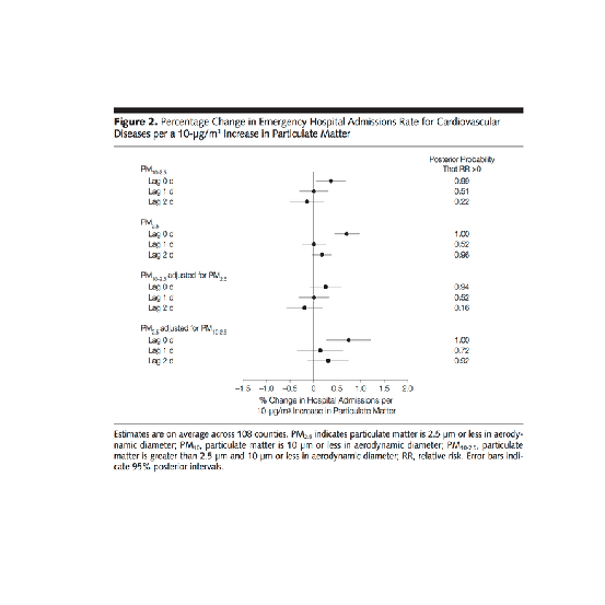
| To show you what we mean, here's an example of a figure taken from a paper published in
| the Journal of the AMA. It shows the relationship between pollution and hospitalization of
| people with heart disease. As you can see, it's a lot different from our previous plots.
| The solid circles in the center portion indicate point estimates of percentage changes in
| hospitalization rates for different levels of pollution. The lines through the circles
| indicate confidence intervals associated with these estimates. (You'll learn more about
| confidence intervals in another great course, the one on statistical inference.)

graph
...

|============================================================== | 75%
| Note that on the right side of the figure is another column of numbers, one for each of
| the point estimates given. This column shows posterior probabilities that relative risk is
| greater than 0. This, in effect, is a measure of the strength of the evidence showing the
| correlation between pollution and hospitalization. The point here is that all of this
| information is located in one picture so that the reader can see the strength of not only
| the correlations but the evidence as well.

...

|================================================================= | 78%
| The fifth principle of graphing involves describing and documenting the evidence with
| sources and appropriate labels and scales. Credibility is important so the data graphics
| should tell a complete story. Also, using R, you want to preserve any code you use to
| generate your data and graphics so that the research can be replicated if necessary. This
| allows for easy verification or finding bugs in your analysis.

...

|=================================================================== | 81%
| The sixth and final principle of analytic graphing is maybe the most important. Content is
| king! If you don't have something interesting to report, your graphs won't save you.
| Analytical presentations ultimately stand or fall depending on the quality, relevance, and
| integrity of their content.

...

|===================================================================== | 83%
| Review time!!!

...

|======================================================================= | 86%
| Which of the following is NOT a good principle of graphing?

1: To integrate multiple modes of evidence
2: Having unreadable labels
3: To describe and document evidence
4: Content is king

Selection: 2

| You are really on a roll!

|========================================================================== | 89%
| Which of the following is NOT a good principle of graphing?

1: To prove you're always right
2: To show two competing hypotheses
3: To demonstrate a causative mechanism underlying a correlation
4: Content is king

Selection: 1

| You nailed it! Good job!

|============================================================================ | 92%
| Which of the following is NOT a good principle of graphing?

1: To integrate different types of evidence
2: To show that some fonts are better than others
3: To show good labels and scales
4: Content is king

Selection: 2

| That's the answer I was looking for.

|============================================================================== | 94%
| True or False? Color is king.

1: False
2: True

Selection: 2

| Not quite, but you're learning! Try again.

| Think of the sixth principle

1: True
2: False

Selection: 2

| You are doing so well!

|================================================================================= | 97%
| Congrats! You've concluded exploring this lesson on principles of graphing. We hope you
| found it principally principled.

...

|===================================================================================| 100%
| Would you like to receive credit for completing this course on Coursera.org?

1: No
2: Yes

Selection: 1

| Nice work!

| You've reached the end of this lesson! Returning to the main menu...

| Please choose a course, or type 0 to exit swirl.

1: Exploratory Data Analysis
2: Getting and Cleaning Data
3: R Programming
4: Take me to the swirl course repository!

Selection: 0

| Leaving swirl now. Type swirl() to resume.

Last updated 2020-05-02 16:41:08.783416 IST

Tidying Data with tidyr

swirl()

| Welcome to swirl! Please sign in. If you've been here before, use the same name as you | did then. If you are new, call yourself something unique.

What shall I call you? Krishnakanth Allika

| Please choose a course, or type 0 to exit swirl.

1: Getting and Cleaning Data
2: R Programming
3: Take me to the swirl course repository!

Selection: 1

| Please choose a lesson, or type 0 to return to course menu.

1: Manipulating Data with dplyr
2: Grouping and Chaining with dplyr
3: Tidying Data with tidyr
4: Dates and Times with lubridate

Selection: 3

| Attempting to load lesson dependencies...

| This lesson requires the ‘readr’ package. Would you like me to install it for you now?

1: Yes
2: No

Selection: 1

| Trying to install package ‘readr’ now...
also installing the dependencies ‘hms’, ‘clipr’

package ‘hms’ successfully unpacked and MD5 sums checked
package ‘clipr’ successfully unpacked and MD5 sums checked
package ‘readr’ successfully unpacked and MD5 sums checked

| Package ‘readr’ loaded correctly!

| This lesson requires the ‘tidyr’ package. Would you like me to install it for you now?

1: Yes
2: No

Selection: 1

| Trying to install package ‘tidyr’ now...
package ‘tidyr’ successfully unpacked and MD5 sums checked

| Package ‘tidyr’ loaded correctly!

| Package ‘dplyr’ loaded correctly!

| | 0%

| In this lesson, you'll learn how to tidy your data with the tidyr package.

...

|= | 2%
| Parts of this lesson will require the use of dplyr. If you don't have a basic knowledge
| of dplyr, you should exit this lesson and begin with the dplyr lessons from earlier in
| the course.

...

|=== | 4%
| tidyr was automatically installed (if necessary) and loaded when you started this
| lesson. Just to build the habit, (re)load the package with library(tidyr).

library(tidyr)

| That's a job well done!

|==== | 5%
| The author of tidyr, Hadley Wickham, discusses his philosophy of tidy data in his 'Tidy
| Data' paper:
|
| http://vita.had.co.nz/papers/tidy-data.pdf
|
| This paper should be required reading for anyone who works with data, but it's not
| required in order to complete this lesson.

...

|====== | 7%
| Tidy data is formatted in a standard way that facilitates exploration and analysis and
| works seamlessly with other tidy data tools. Specifically, tidy data satisfies three
| conditions:
|
| 1) Each variable forms a column
|
| 2) Each observation forms a row
|
| 3) Each type of observational unit forms a table

...

|======= | 9%
| Any dataset that doesn't satisfy these conditions is considered 'messy' data.
| Therefore, all of the following are characteristics of messy data, EXCEPT...

1: Variables are stored in both rows and columns
2: Column headers are values, not variable names
3: Every column contains a different variable
4: Multiple types of observational units are stored in the same table
5: Multiple variables are stored in one column
6: A single observational unit is stored in multiple tables

Selection: 3

| Keep up the great work!

|========= | 11%
| The incorrect answers to the previous question are the most common symptoms of messy
| data. Let's work through a simple example of each of these five cases, then tidy some
| real data.

...

|========== | 13%
| The first problem is when you have column headers that are values, not variable names.
| I've created a simple dataset called 'students' that demonstrates this scenario. Type
| students to take a look.

play()

| Entering play mode. Experiment as you please, then type nxt() when you are ready to
| resume the lesson.

download.file("http://vita.had.co.nz/papers/tidy-data.pdf","tidy-data.pdf")
trying URL 'http://vita.had.co.nz/papers/tidy-data.pdf'
Content type 'application/pdf' length 360450 bytes (352 KB)
downloaded 352 KB

nxt()

| Resuming lesson...

| The first problem is when you have column headers that are values, not variable names.
| I've created a simple dataset called 'students' that demonstrates this scenario. Type
| students to take a look.

students
grade male female
1 A 5 3
2 B 4 1
3 C 8 6
4 D 4 5
5 E 5 5

| That's a job well done!

|============ | 15%
| The first column represents each of five possible grades that students could receive
| for a particular class. The second and third columns give the number of male and female
| students, respectively, that received each grade.

...

|============= | 16%
| This dataset actually has three variables: grade, sex, and count. The first variable,
| grade, is already a column, so that should remain as it is. The second variable, sex,
| is captured by the second and third column headings. The third variable, count, is the
| number of students for each combination of grade and sex.

...

|=============== | 18%
| To tidy the students data, we need to have one column for each of these three
| variables. We'll use the gather() function from tidyr to accomplish this. Pull up the
| documentation for this function with ?gather.

?gather

| Nice work!

|================ | 20%
| Using the help file as a guide, call gather() with the following arguments (in order):
| students, sex, count, -grade. Note the minus sign before grade, which says we want to
| gather all columns EXCEPT grade.

gather(students,sex,count,-grade)
grade sex count
1 A male 5
2 B male 4
3 C male 8
4 D male 4
5 E male 5
6 A female 3
7 B female 1
8 C female 6
9 D female 5
10 E female 5

| All that hard work is paying off!

|================= | 22%
| Each row of the data now represents exactly one observation, characterized by a unique
| combination of the grade and sex variables. Each of our variables (grade, sex, and
| count) occupies exactly one column. That's tidy data!

...

|=================== | 24%
| It's important to understand what each argument to gather() means. The data argument,
| students, gives the name of the original dataset. The key and value arguments -- sex
| and count, respectively -- give the column names for our tidy dataset. The final
| argument, -grade, says that we want to gather all columns EXCEPT the grade column
| (since grade is already a proper column variable.)

...

|==================== | 25%
| The second messy data case we'll look at is when multiple variables are stored in one
| column. Type students2 to see an example of this.

students2
grade male_1 female_1 male_2 female_2
1 A 7 0 5 8
2 B 4 0 5 8
3 C 7 4 5 6
4 D 8 2 8 1
5 E 8 4 1 0

| Excellent work!

|====================== | 27%
| This dataset is similar to the first, except now there are two separate classes, 1 and
| 2, and we have total counts for each sex within each class. students2 suffers from the
| same messy data problem of having column headers that are values (male_1, female_1,
| etc.) and not variable names (sex, class, and count).

...

|======================= | 29%
| However, it also has multiple variables stored in each column (sex and class), which is
| another common symptom of messy data. Tidying this dataset will be a two step process.

...

|========================= | 31%
| Let's start by using gather() to stack the columns of students2, like we just did with
| students. This time, name the 'key' column sex_class and the 'value' column count. Save
| the result to a new variable called res. Consult ?gather again if you need help.

res<-gather(students2,sex_class,count,-grade)

| Your dedication is inspiring!

|========================== | 33%
| Print res to the console to see what we accomplished.

res
grade sex_class count
1 A male_1 7
2 B male_1 4
3 C male_1 7
4 D male_1 8
5 E male_1 8
6 A female_1 0
7 B female_1 0
8 C female_1 4
9 D female_1 2
10 E female_1 4
11 A male_2 5
12 B male_2 5
13 C male_2 5
14 D male_2 8
15 E male_2 1
16 A female_2 8
17 B female_2 8
18 C female_2 6
19 D female_2 1
20 E female_2 0

| Your dedication is inspiring!

|============================ | 35%
| That got us half way to tidy data, but we still have two different variables, sex and
| class, stored together in the sex_class column. tidyr offers a convenient separate()
| function for the purpose of separating one column into multiple columns. Pull up the
| help file for separate() now.

?separate

| You got it right!

|============================= | 36%
| Call separate() on res to split the sex_class column into sex and class. You only need
| to specify the first three arguments: data = res, col = sex_class, into = c("sex",
| "class"). You don't have to provide the argument names as long as they are in the
| correct order.

separate(data=res,col=sex_class,into=c("sex","class"))
grade sex class count
1 A male 1 7
2 B male 1 4
3 C male 1 7
4 D male 1 8
5 E male 1 8
6 A female 1 0
7 B female 1 0
8 C female 1 4
9 D female 1 2
10 E female 1 4
11 A male 2 5
12 B male 2 5
13 C male 2 5
14 D male 2 8
15 E male 2 1
16 A female 2 8
17 B female 2 8
18 C female 2 6
19 D female 2 1
20 E female 2 0

| You are amazing!

|=============================== | 38%
| Conveniently, separate() was able to figure out on its own how to separate the
| sex_class column. Unless you request otherwise with the 'sep' argument, it splits on
| non-alphanumeric values. In other words, it assumes that the values are separated by
| something other than a letter or number (in this case, an underscore.)

...

|================================ | 40%
| Tidying students2 required both gather() and separate(), causing us to save an
| intermediate result (res). However, just like with dplyr, you can use the %>% operator
| to chain multiple function calls together.

...

|================================= | 42%
| I've opened an R script for you to give this a try. Follow the directions in the
| script, then save the script and type submit() at the prompt when you are ready. If you
| get stuck and want to start over, you can type reset() to reset the script to its
| original state.

{r}
# Repeat your calls to gather() and separate(), but this time
# use the %>% operator to chain the commands together without
# storing an intermediate result.
#
# If this is your first time seeing the %>% operator, check
# out ?chain, which will bring up the relevant documentation.
# You can also look at the Examples section at the bottom
# of ?gather and ?separate.
#
# The main idea is that the result to the left of %>%
# takes the place of the first argument of the function to
# the right. Therefore, you OMIT THE FIRST ARGUMENT to each
# function.
#
students2 %>%
  gather(sex_class ,count ,-grade ) %>%
  separate(sex_class , c("sex", "class")) %>%
  print

submit()

| Sourcing your script...

grade sex class count
1 A male 1 7
2 B male 1 4
3 C male 1 7
4 D male 1 8
5 E male 1 8
6 A female 1 0
7 B female 1 0
8 C female 1 4
9 D female 1 2
10 E female 1 4
11 A male 2 5
12 B male 2 5
13 C male 2 5
14 D male 2 8
15 E male 2 1
16 A female 2 8
17 B female 2 8
18 C female 2 6
19 D female 2 1
20 E female 2 0

| Excellent work!

|=================================== | 44%
| A third symptom of messy data is when variables are stored in both rows and columns.
| students3 provides an example of this. Print students3 to the console.

students3
name test class1 class2 class3 class4 class5
1 Sally midterm A B
2 Sally final C C
3 Jeff midterm D A
4 Jeff final E C
5 Roger midterm C B
6 Roger final A A
7 Karen midterm C A
8 Karen final C A
9 Brian midterm B A
10 Brian final B C

| You got it right!

|==================================== | 45%
| In students3, we have midterm and final exam grades for five students, each of whom
| were enrolled in exactly two of five possible classes.

...

|====================================== | 47%
| The first variable, name, is already a column and should remain as it is. The headers
| of the last five columns, class1 through class5, are all different values of what
| should be a class variable. The values in the test column, midterm and final, should
| each be its own variable containing the respective grades for each student.

...

|======================================= | 49%
| This will require multiple steps, which we will build up gradually using %>%. Edit the
| R script, save it, then type submit() when you are ready. Type reset() to reset the
| script to its original state.

{r}
# Call gather() to gather the columns class1
# through class5 into a new variable called class.
# The 'key' should be class, and the 'value'
# should be grade.
#
# tidyr makes it easy to reference multiple adjacent
# columns with class1:class5, just like with sequences
# of numbers.
#
# Since each student is only enrolled in two of
# the five possible classes, there are lots of missing
# values (i.e. NAs). Use the argument na.rm = TRUE
# to omit these values from the final result.
#
# Remember that when you're using the %>% operator,
# the value to the left of it gets inserted as the
# first argument to the function on the right.
#
# Consult ?gather and/or ?chain if you get stuck.
#
students3 %>%
  gather(class ,grade , class1:class5 ,na.rm = TRUE) %>%
  print

submit()

| Sourcing your script...

name    test  class grade  

1 Sally midterm class1 A
2 Sally final class1 C
9 Brian midterm class1 B
10 Brian final class1 B
13 Jeff midterm class2 D
14 Jeff final class2 E
15 Roger midterm class2 C
16 Roger final class2 A
21 Sally midterm class3 B
22 Sally final class3 C
27 Karen midterm class3 C
28 Karen final class3 C
33 Jeff midterm class4 A
34 Jeff final class4 C
37 Karen midterm class4 A
38 Karen final class4 A
45 Roger midterm class5 B
46 Roger final class5 A
49 Brian midterm class5 A
50 Brian final class5 C

| That's correct!

|========================================= | 51%
| The next step will require the use of spread(). Pull up the documentation for spread()
| now.

?spread

| Keep working like that and you'll get there!

|========================================== | 53%
| Edit the R script, then save it and type submit() when you are ready. Type reset() to
| reset the script to its original state.

{r}
# This script builds on the previous one by appending
# a call to spread(), which will allow us to turn the
# values of the test column, midterm and final, into
# column headers (i.e. variables).
#
# You only need to specify two arguments to spread().
# Can you figure out what they are? (Hint: You don't
# have to specify the data argument since we're using
# the %>% operator.
#
students3 %>%
  gather(class, grade, class1:class5, na.rm = TRUE) %>%
  spread( test, grade) %>%
  print

submit()

| Sourcing your script...

name  class final midterm  

1 Brian class1 B B
2 Brian class5 C A
3 Jeff class2 E D
4 Jeff class4 C A
5 Karen class3 C C
6 Karen class4 A A
7 Roger class2 A C
8 Roger class5 A B
9 Sally class1 C A
10 Sally class3 C B

| All that practice is paying off!

|============================================ | 55%
| readr is required for certain data manipulations, such as `parse_number(), which will
| be used in the next question. Let's, (re)load the package with library(readr).

library(readr)

| Nice work!

|============================================= | 56%
| Lastly, we want the values in the class column to simply be 1, 2, ..., 5 and not
| class1, class2, ..., class5. We can use the parse_number() function from readr to
| accomplish this. To see how it works, try parse_number("class5").

parse_number("class5")
[1] 5

| Your dedication is inspiring!

|=============================================== | 58%
| Now, the final step. Edit the R script, then save it and type submit() when you are
| ready. Type reset() to reset the script to its original state.

{r}
# We want the values in the class columns to be
# 1, 2, ..., 5 and not class1, class2, ..., class5.
#
# Use the mutate() function from dplyr along with
# parse_number(). Hint: You can "overwrite" a column
# with mutate() by assigning a new value to the existing
# column instead of creating a new column.
#
# Check out ?mutate and/or ?parse_number if you need
# a refresher.
#
students3 %>%
  gather(class, grade, class1:class5, na.rm = TRUE) %>%
  spread(test, grade) %>%
  ### Call to mutate() goes here %>%
  mutate(class=parse_number(class)) %>%
  print

submit()

| Sourcing your script...

name class final midterm  

1 Brian 1 B B
2 Brian 5 C A
3 Jeff 2 E D
4 Jeff 4 C A
5 Karen 3 C C
6 Karen 4 A A
7 Roger 2 A C
8 Roger 5 A B
9 Sally 1 C A
10 Sally 3 C B

| You got it!

|================================================ | 60%
| The fourth messy data problem we'll look at occurs when multiple observational units
| are stored in the same table. students4 presents an example of this. Take a look at the
| data now.

students4
id name sex class midterm final
1 168 Brian F 1 B B
2 168 Brian F 5 A C
3 588 Sally M 1 A C
4 588 Sally M 3 B C
5 710 Jeff M 2 D E
6 710 Jeff M 4 A C
7 731 Roger F 2 C A
8 731 Roger F 5 B A
9 908 Karen M 3 C C
10 908 Karen M 4 A A

| You are doing so well!

|================================================= | 62%
| students4 is almost the same as our tidy version of students3. The only difference is
| that students4 provides a unique id for each student, as well as his or her sex (M =
| male; F = female).

...

|=================================================== | 64%
| At first glance, there doesn't seem to be much of a problem with students4. All columns
| are variables and all rows are observations. However, notice that each id, name, and
| sex is repeated twice, which seems quite redundant. This is a hint that our data
| contains multiple observational units in a single table.

...

|==================================================== | 65%
| Our solution will be to break students4 into two separate tables -- one containing
| basic student information (id, name, and sex) and the other containing grades (id,
| class, midterm, final).
|
| Edit the R script, save it, then type submit() when you are ready. Type reset() to
| reset the script to its original state.

{r}
# Complete the chained command below so that we are
# selecting the id, name, and sex column from students4
# and storing the result in student_info.
#
student_info <- students4 %>%
  select(id ,name ,sex ) %>%
  print

submit()

| Sourcing your script...

id  name sex  

1 168 Brian F
2 168 Brian F
3 588 Sally M
4 588 Sally M
5 710 Jeff M
6 710 Jeff M
7 731 Roger F
8 731 Roger F
9 908 Karen M
10 908 Karen M

| You are amazing!

|====================================================== | 67%
| Notice anything strange about student_info? It contains five duplicate rows! See the
| script for directions on how to fix this. Save the script and type submit() when you
| are ready, or type reset() to reset the script to its original state.

{r}
# Add a call to unique() below, which will remove
# duplicate rows from student_info.
#
# Like with the call to the print() function below,
# you can omit the parentheses after the function name.
# This is a nice feature of %>% that applies when
# there are no additional arguments to specify.
#
student_info <- students4 %>%
  select(id, name, sex) %>%
  ### Your code here %>%
  unique() %>%
  print

submit()

| Sourcing your script...

id name sex
1 168 Brian F
3 588 Sally M
5 710 Jeff M
7 731 Roger F
9 908 Karen M

| Excellent job!

|======================================================= | 69%
| Now, using the script I just opened for you, create a second table called gradebook
| using the id, class, midterm, and final columns (in that order).
|
| Edit the R script, save it, then type submit() when you are ready. Type reset() to
| reset the script to its original state.

{r}
# select() the id, class, midterm, and final columns
# (in that order) and store the result in gradebook.
#
gradebook <- students4 %>%
  ### Your code here %>%
  select(id,class,midterm,final) %>%
  print

submit()

| Sourcing your script...

id class midterm final  

1 168 1 B B
2 168 5 A C
3 588 1 A C
4 588 3 B C
5 710 2 D E
6 710 4 A C
7 731 2 C A
8 731 5 B A
9 908 3 C C
10 908 4 A A

| You are quite good my friend!

|========================================================= | 71%
| It's important to note that we left the id column in both tables. In the world of
| relational databases, 'id' is called our 'primary key' since it allows us to connect
| each student listed in student_info with their grades listed in gradebook. Without a
| unique identifier, we might not know how the tables are related. (In this case, we
| could have also used the name variable, since each student happens to have a unique
| name.)

...

|========================================================== | 73%
| The fifth and final messy data scenario that we'll address is when a single
| observational unit is stored in multiple tables. It's the opposite of the fourth
| problem.

...

|============================================================ | 75%
| To illustrate this, we've created two datasets, passed and failed. Take a look at
| passed now.

passed
name class final
1 Brian 1 B
2 Roger 2 A
3 Roger 5 A
4 Karen 4 A

| All that hard work is paying off!

|============================================================= | 76%
| Now view the contents of failed.

failed
name class final
1 Brian 5 C
2 Sally 1 C
3 Sally 3 C
4 Jeff 2 E
5 Jeff 4 C
6 Karen 3 C

| Your dedication is inspiring!

|=============================================================== | 78%
| Teachers decided to only take into consideration final exam grades in determining
| whether students passed or failed each class. As you may have inferred from the data,
| students passed a class if they received a final exam grade of A or B and failed
| otherwise.

...

|================================================================ | 80%
| The name of each dataset actually represents the value of a new variable that we will
| call 'status'. Before joining the two tables together, we'll add a new column to each
| containing this information so that it's not lost when we put everything together.

...

|================================================================= | 82%
| Use dplyr's mutate() to add a new column to the passed table. The column should be
| called status and the value, "passed" (a character string), should be the same for all
| students. 'Overwrite' the current version of passed with the new one.

passed<-mutate(passed,status="passed")

| That's a job well done!

|=================================================================== | 84%
| Now, do the same for the failed table, except the status column should have the value
| "failed" for all students.

failed<-mutate(failed,status="failed")

| Perseverance, that's the answer.

|==================================================================== | 85%
| Now, pass as arguments the passed and failed tables (in order) to the dplyr function
| bind_rows(), which will join them together into a single unit. Check ?bind_rows if you
| need help.
|
| Note: bind_rows() is only available in dplyr 0.4.0 or later. If you have an older
| version of dplyr, please quit the lesson, update dplyr, then restart the lesson where
| you left off. If you're not sure what version of dplyr you have, type
| packageVersion('dplyr').

bind_rows(passed,failed)
name class final status
1 Brian 1 B passed
2 Roger 2 A passed
3 Roger 5 A passed
4 Karen 4 A passed
5 Brian 5 C failed
6 Sally 1 C failed
7 Sally 3 C failed
8 Jeff 2 E failed
9 Jeff 4 C failed
10 Karen 3 C failed

| You nailed it! Good job!

|====================================================================== | 87%
| Of course, we could arrange the rows however we wish at this point, but the important
| thing is that each row is an observation, each column is a variable, and the table
| contains a single observational unit. Thus, the data are tidy.

...

|======================================================================= | 89%
| We've covered a lot in this lesson. Let's bring everything together and tidy a real
| dataset.

...

|========================================================================= | 91%
| The SAT is a popular college-readiness exam in the United States that consists of three
| sections: critical reading, mathematics, and writing. Students can earn up to 800
| points on each section. This dataset presents the total number of students, for each
| combination of exam section and sex, within each of six score ranges. It comes from the
| 'Total Group Report 2013', which can be found here:
|
| http://research.collegeboard.org/programs/sat/data/cb-seniors-2013

...

|========================================================================== | 93%
| I've created a variable called 'sat' in your workspace, which contains data on all
| college-bound seniors who took the SAT exam in 2013. Print the dataset now.

sat
# A tibble: 6 x 10
score_range read_male read_fem read_total math_male math_fem math_total write_male

1 700-800 40151 38898 79049 74461 46040 120501 31574
2 600-690 121950 126084 248034 162564 133954 296518 100963
3 500-590 227141 259553 486694 233141 257678 490819 202326
4 400-490 242554 296793 539347 204670 288696 493366 262623
5 300-390 113568 133473 247041 82468 131025 213493 146106
6 200-290 30728 29154 59882 18788 26562 45350 32500
# ... with 2 more variables: write_fem , write_total

| That's a job well done!

|============================================================================ | 95%
| As we've done before, we'll build up a series of chained commands, using functions from
| both tidyr and dplyr. Edit the R script, save it, then type submit() when you are
| ready. Type reset() to reset the script to its original state.

{r}
# Accomplish the following three goals:
#
# 1. select() all columns that do NOT contain the word "total",
# since if we have the male and female data, we can always
# recreate the total count in a separate column, if we want it.
# Hint: Use the contains() function, which you'll
# find detailed in 'Special functions' section of ?select.
#
# 2. gather() all columns EXCEPT score_range, using
# key = part_sex and value = count.
#
# 3. separate() part_sex into two separate variables (columns),
# called "part" and "sex", respectively. You may need to check
# the 'Examples' section of ?separate to remember how the 'into'
# argument should be phrased.
#
sat %>%
  select(-contains("total")) %>%
  gather(part_sex, count, -score_range) %>%
  ### <Your call to separate()> %>%
  separate(part_sex,c("part","sex")) %>%
  print

submit()

| Sourcing your script...

# A tibble: 36 x 4
score_range part sex count

1 700-800 read male 40151
2 600-690 read male 121950
3 500-590 read male 227141
4 400-490 read male 242554
5 300-390 read male 113568
6 200-290 read male 30728
7 700-800 read fem 38898
8 600-690 read fem 126084
9 500-590 read fem 259553
10 400-490 read fem 296793
# ... with 26 more rows

| You got it!

|============================================================================= | 96%
| Finish off the job by following the directions in the script. Save the script and type
| submit() when you are ready, or type reset() to reset the script to its original state.

{r}
# Append two more function calls to accomplish the following:
#
# 1. Use group_by() (from dplyr) to group the data by part and
# sex, in that order.
#
# 2. Use mutate to add two new columns, whose values will be
# automatically computed group-by-group:
#
#   * total = sum(count)
#   * prop = count / total
#
sat %>%
  select(-contains("total")) %>%
  gather(part_sex, count, -score_range) %>%
  separate(part_sex, c("part", "sex")) %>%
  ### <Your call to group_by()> %>%
  group_by(part,sex) %>%
  mutate(total = sum(count),
         prop = count / total
  ) %>% print

submit()

| Sourcing your script...

# A tibble: 36 x 6
# Groups: part, sex [6]
score_range part sex count total prop

1 700-800 read male 40151 776092 0.0517
2 600-690 read male 121950 776092 0.157
3 500-590 read male 227141 776092 0.293
4 400-490 read male 242554 776092 0.313
5 300-390 read male 113568 776092 0.146
6 200-290 read male 30728 776092 0.0396
7 700-800 read fem 38898 883955 0.0440
8 600-690 read fem 126084 883955 0.143
9 500-590 read fem 259553 883955 0.294
10 400-490 read fem 296793 883955 0.336
# ... with 26 more rows

| Keep up the great work!

|=============================================================================== | 98%
| In this lesson, you learned how to tidy data with tidyr and dplyr. These tools will
| help you spend less time and energy getting your data ready to analyze and more time
| actually analyzing it.

...

|================================================================================| 100%
| Would you like to receive credit for completing this course on Coursera.org?

1: Yes
2: No

Selection: 1
What is your email address? xxxxxx@xxxxxxxxxxxx
What is your assignment token? xXxXxxXXxXxxXXXx
Grade submission succeeded!

| Excellent job!

| You've reached the end of this lesson! Returning to the main menu...

| Please choose a course, or type 0 to exit swirl.

1: Getting and Cleaning Data
2: R Programming
3: Take me to the swirl course repository!

Selection: 0

| Leaving swirl now. Type swirl() to resume.

ls()
[1] "failed" "gradebook" "passed" "res" "sat"
[6] "student_info" "students" "students2" "students3" "students4"
rm(list=ls())
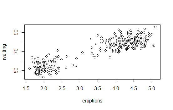
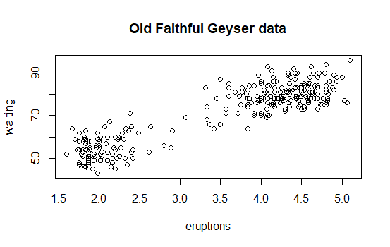
Last updated 2020-04-23 21:12:57.937316 IST

Grouping and Chaining with dplyr

R version 3.6.3 (2020-02-29) -- "Holding the Windsock"
Copyright (C) 2020 The R Foundation for Statistical Computing
Platform: x86_64-w64-mingw32/x64 (64-bit)

R is free software and comes with ABSOLUTELY NO WARRANTY.
You are welcome to redistribute it under certain conditions.
Type 'license()' or 'licence()' for distribution details.

R is a collaborative project with many contributors.
Type 'contributors()' for more information and
'citation()' on how to cite R or R packages in publications.

Type 'demo()' for some demos, 'help()' for on-line help, or
'help.start()' for an HTML browser interface to help.
Type 'q()' to quit R.

[Workspace loaded from C:/Users/kk/PortableApps/Git/home/k-allika/repos/DataScienceWithR/.RData]

setwd("C:/Users/kk/PortableApps/Git/home/k-allika/repos/DataScienceWithR/03_Getting_and_Cleaning_Data/Week03/workspace")
library(swirl)

| Hi! Type swirl() when you are ready to begin.

swirl()

| Welcome to swirl! Please sign in. If you've been here before, use the same name as you
| did then. If you are new, call yourself something unique.

What shall I call you? Krishnakanth allika

| Please choose a course, or type 0 to exit swirl.

1: Getting and Cleaning Data
2: R Programming
3: Take me to the swirl course repository!

Selection: 1

| Please choose a lesson, or type 0 to return to course menu.

1: Manipulating Data with dplyr
2: Grouping and Chaining with dplyr
3: Tidying Data with tidyr
4: Dates and Times with lubridate

Selection: 2

| Attempting to load lesson dependencies...

| Package ‘dplyr’ loaded correctly!

| | 0%

| Warning: This lesson makes use of the View() function. View() may not work properly in
| every programming environment. We highly recommend the use of RStudio for this lesson.

...

|== | 2%
| In the last lesson, you learned about the five main data manipulation 'verbs' in dplyr:
| select(), filter(), arrange(), mutate(), and summarize(). The last of these,
| summarize(), is most powerful when applied to grouped data.

...

|=== | 4%
| The main idea behind grouping data is that you want to break up your dataset into
| groups of rows based on the values of one or more variables. The group_by() function is
| reponsible for doing this.

...

|===== | 6%
| We'll continue where we left off with RStudio's CRAN download log from July 8, 2014,
| which contains information on roughly 225,000 R package downloads
| (http://cran-logs.rstudio.com/).

...

|====== | 8%
| As with the last lesson, the dplyr package was automatically installed (if necessary)
| and loaded at the beginning of this lesson. Normally, this is something you would have
| to do on your own. Just to build the habit, type library(dplyr) now to load the package
| again.

library(dplyr)

| That's the answer I was looking for.

|======== | 10%
| I've made the dataset available to you in a data frame called mydf. Put it in a 'data
| frame tbl' using the tbl_df() function and store the result in a object called cran. If
| you're not sure what I'm talking about, you should start with the previous lesson.
| Otherwise, practice makes perfect!

cran<-as_tibble(mydf)

| Not exactly. Give it another go. Or, type info() for more options.

| Type cran <- tbl_df(mydf) to store the data in a new tbl_df called cran.

cran<-tbl_df(mydf)

| You are doing so well!

|========= | 12%
| To avoid confusion and keep things running smoothly, let's remove the original
| dataframe from your workspace with rm("mydf").

rm("mydf")

| All that hard work is paying off!

|=========== | 13%
| Print cran to the console.

cran
# A tibble: 225,468 x 11
X date time size r_version r_arch r_os package version country ip_id

1 1 2014-07~ 00:54:~ 80589 3.1.0 x86_64 mingw32 htmltools 0.2.4 US 1
2 2 2014-07~ 00:59:~ 321767 3.1.0 x86_64 mingw32 tseries 0.10-32 US 2
3 3 2014-07~ 00:47:~ 748063 3.1.0 x86_64 linux-~ party 1.0-15 US 3
4 4 2014-07~ 00:48:~ 606104 3.1.0 x86_64 linux-~ Hmisc 3.14-4 US 3
5 5 2014-07~ 00:46:~ 79825 3.0.2 x86_64 linux-~ digest 0.6.4 CA 4
6 6 2014-07~ 00:48:~ 77681 3.1.0 x86_64 linux-~ randomFo~ 4.6-7 US 3
7 7 2014-07~ 00:48:~ 393754 3.1.0 x86_64 linux-~ plyr 1.8.1 US 3
8 8 2014-07~ 00:47:~ 28216 3.0.2 x86_64 linux-~ whisker 0.3-2 US 5
9 9 2014-07~ 00:54:~ 5928 NA NA NA Rcpp 0.10.4 CN 6
10 10 2014-07~ 00:15:~ 2206029 3.0.2 x86_64 linux-~ hflights 0.1 US 7
# ... with 225,458 more rows

| You nailed it! Good job!

|============ | 15%
| Our first goal is to group the data by package name. Bring up the help file for
| group_by().

group_by(cran,package)
# A tibble: 225,468 x 11
# Groups: package [6,023]
X date time size r_version r_arch r_os package version country ip_id

1 1 2014-07~ 00:54:~ 80589 3.1.0 x86_64 mingw32 htmltools 0.2.4 US 1
2 2 2014-07~ 00:59:~ 321767 3.1.0 x86_64 mingw32 tseries 0.10-32 US 2
3 3 2014-07~ 00:47:~ 748063 3.1.0 x86_64 linux-~ party 1.0-15 US 3
4 4 2014-07~ 00:48:~ 606104 3.1.0 x86_64 linux-~ Hmisc 3.14-4 US 3
5 5 2014-07~ 00:46:~ 79825 3.0.2 x86_64 linux-~ digest 0.6.4 CA 4
6 6 2014-07~ 00:48:~ 77681 3.1.0 x86_64 linux-~ randomFo~ 4.6-7 US 3
7 7 2014-07~ 00:48:~ 393754 3.1.0 x86_64 linux-~ plyr 1.8.1 US 3
8 8 2014-07~ 00:47:~ 28216 3.0.2 x86_64 linux-~ whisker 0.3-2 US 5
9 9 2014-07~ 00:54:~ 5928 NA NA NA Rcpp 0.10.4 CN 6
10 10 2014-07~ 00:15:~ 2206029 3.0.2 x86_64 linux-~ hflights 0.1 US 7
# ... with 225,458 more rows

| Keep trying! Or, type info() for more options.

| Use ?group_by to bring up the documentation.

cran %>% group_by(package)
# A tibble: 225,468 x 11
# Groups: package [6,023]
X date time size r_version r_arch r_os package version country ip_id

1 1 2014-07~ 00:54:~ 80589 3.1.0 x86_64 mingw32 htmltools 0.2.4 US 1
2 2 2014-07~ 00:59:~ 321767 3.1.0 x86_64 mingw32 tseries 0.10-32 US 2
3 3 2014-07~ 00:47:~ 748063 3.1.0 x86_64 linux-~ party 1.0-15 US 3
4 4 2014-07~ 00:48:~ 606104 3.1.0 x86_64 linux-~ Hmisc 3.14-4 US 3
5 5 2014-07~ 00:46:~ 79825 3.0.2 x86_64 linux-~ digest 0.6.4 CA 4
6 6 2014-07~ 00:48:~ 77681 3.1.0 x86_64 linux-~ randomFo~ 4.6-7 US 3
7 7 2014-07~ 00:48:~ 393754 3.1.0 x86_64 linux-~ plyr 1.8.1 US 3
8 8 2014-07~ 00:47:~ 28216 3.0.2 x86_64 linux-~ whisker 0.3-2 US 5
9 9 2014-07~ 00:54:~ 5928 NA NA NA Rcpp 0.10.4 CN 6
10 10 2014-07~ 00:15:~ 2206029 3.0.2 x86_64 linux-~ hflights 0.1 US 7
# ... with 225,458 more rows

| You almost had it, but not quite. Try again. Or, type info() for more options.

| Use ?group_by to bring up the documentation.

?group_by

| Your dedication is inspiring!

|============== | 17%
| Group cran by the package variable and store the result in a new object called
| by_package.

by_package<-cran %>% group_by(package)

| That's not the answer I was looking for, but try again. Or, type info() for more
| options.

| Store the result of group_by(cran, package) in a new object called by_package.

by_package<-group_by(cran,package)

| You got it right!

|=============== | 19%
| Let's take a look at by_package. Print it to the console.

by_package
# A tibble: 225,468 x 11
# Groups: package [6,023]
X date time size r_version r_arch r_os package version country ip_id

1 1 2014-07~ 00:54:~ 80589 3.1.0 x86_64 mingw32 htmltools 0.2.4 US 1
2 2 2014-07~ 00:59:~ 321767 3.1.0 x86_64 mingw32 tseries 0.10-32 US 2
3 3 2014-07~ 00:47:~ 748063 3.1.0 x86_64 linux-~ party 1.0-15 US 3
4 4 2014-07~ 00:48:~ 606104 3.1.0 x86_64 linux-~ Hmisc 3.14-4 US 3
5 5 2014-07~ 00:46:~ 79825 3.0.2 x86_64 linux-~ digest 0.6.4 CA 4
6 6 2014-07~ 00:48:~ 77681 3.1.0 x86_64 linux-~ randomFo~ 4.6-7 US 3
7 7 2014-07~ 00:48:~ 393754 3.1.0 x86_64 linux-~ plyr 1.8.1 US 3
8 8 2014-07~ 00:47:~ 28216 3.0.2 x86_64 linux-~ whisker 0.3-2 US 5
9 9 2014-07~ 00:54:~ 5928 NA NA NA Rcpp 0.10.4 CN 6
10 10 2014-07~ 00:15:~ 2206029 3.0.2 x86_64 linux-~ hflights 0.1 US 7
# ... with 225,458 more rows

| Excellent work!

|================= | 21%
| At the top of the output above, you'll see 'Groups: package', which tells us that this
| tbl has been grouped by the package variable. Everything else looks the same, but now
| any operation we apply to the grouped data will take place on a per package basis.

...

|================== | 23%
| Recall that when we applied mean(size) to the original tbl_df via summarize(), it
| returned a single number -- the mean of all values in the size column. We may care
| about what that number is, but wouldn't it be so much more interesting to look at the
| mean download size for each unique package?

...

|==================== | 25%
| That's exactly what you'll get if you use summarize() to apply mean(size) to the
| grouped data in by_package. Give it a shot.

summarise(by_package,mean(size))
# A tibble: 6,023 x 2
package mean(size)

1 A3 62195.
2 abc 4826665
3 abcdeFBA 455980.
4 ABCExtremes 22904.
5 ABCoptim 17807.
6 ABCp2 30473.
7 abctools 2589394
8 abd 453631.
9 abf2 35693.
10 abind 32939.
# ... with 6,013 more rows

| You got it right!

|====================== | 27%
| Instead of returning a single value, summarize() now returns the mean size for EACH
| package in our dataset.

...

|======================= | 29%
| Let's take it a step further. I just opened an R script for you that contains a
| partially constructed call to summarize(). Follow the instructions in the script
| comments.
|
| When you are ready to move on, save the script and type submit(), or type reset() to
| reset the script to its original state.

play()

| Entering play mode. Experiment as you please, then type nxt() when you are ready to
| resume the lesson.

?n
?n_distinct
nxt()

| Resuming lesson...

| Let's take it a step further. I just opened an R script for you that contains a
| partially constructed call to summarize(). Follow the instructions in the script
| comments.
|
| When you are ready to move on, save the script and type submit(), or type reset() to
| reset the script to its original state.

{r}
# Compute four values, in the following order, from
# the grouped data:
#
# 1. count = n()
# 2. unique = n_distinct(ip_id)
# 3. countries = n_distinct(country)
# 4. avg_bytes = mean(size)
#
# A few thing to be careful of:
#
# 1. Separate arguments by commas
# 2. Make sure you have a closing parenthesis
# 3. Check your spelling!
# 4. Store the result in pack_sum (for 'package summary')
#
# You should also take a look at ?n and ?n_distinct, so
# that you really understand what is going on.

pack_sum <- summarize(by_package,
                      count = n(),
                      unique = n_distinct(ip_id),
                      countries = n_distinct(country),
                      avg_bytes = mean(size))

submit()

| Sourcing your script...

| You are doing so well!

|========================= | 31%
| Print the resulting tbl, pack_sum, to the console to examine its contents.

pack_sum
# A tibble: 6,023 x 5
package count unique countries avg_bytes

1 A3 25 24 10 62195.
2 abc 29 25 16 4826665
3 abcdeFBA 15 15 9 455980.
4 ABCExtremes 18 17 9 22904.
5 ABCoptim 16 15 9 17807.
6 ABCp2 18 17 10 30473.
7 abctools 19 19 11 2589394
8 abd 17 16 10 453631.
9 abf2 13 13 9 35693.
10 abind 396 365 50 32939.
# ... with 6,013 more rows

| That's the answer I was looking for.

|========================== | 33%
| The 'count' column, created with n(), contains the total number of rows (i.e.
| downloads) for each package. The 'unique' column, created with n_distinct(ip_id), gives
| the total number of unique downloads for each package, as measured by the number of
| distinct ip_id's. The 'countries' column, created with n_distinct(country), provides
| the number of countries in which each package was downloaded. And finally, the
| 'avg_bytes' column, created with mean(size), contains the mean download size (in bytes)
| for each package.

...

|============================ | 35%
| It's important that you understand how each column of pack_sum was created and what it
| means. Now that we've summarized the data by individual packages, let's play around
| with it some more to see what we can learn.

...

|============================= | 37%
| Naturally, we'd like to know which packages were most popular on the day these data
| were collected (July 8, 2014). Let's start by isolating the top 1% of packages, based
| on the total number of downloads as measured by the 'count' column.

...

|=============================== | 38%
| We need to know the value of 'count' that splits the data into the top 1% and bottom
| 99% of packages based on total downloads. In statistics, this is called the 0.99, or
| 99%, sample quantile. Use quantile(pack_sum$count, probs = 0.99) to determine this
| number.

quantile(pack_sum$count, probs = 0.99)
99%
679.56

| You're the best!

|================================ | 40%
| Now we can isolate only those packages which had more than 679 total downloads. Use
| filter() to select all rows from pack_sum for which 'count' is strictly greater (>)
| than 679. Store the result in a new object called top_counts.

top_counts<-filter(pack_sum,count>679)

| You are doing so well!

|================================== | 42%
| Let's take a look at top_counts. Print it to the console.

top_counts
# A tibble: 61 x 5
package count unique countries avg_bytes

1 bitops 1549 1408 76 28715.
2 car 1008 837 64 1229122.
3 caTools 812 699 64 176589.
4 colorspace 1683 1433 80 357411.
5 data.table 680 564 59 1252721.
6 DBI 2599 492 48 206933.
7 devtools 769 560 55 212933.
8 dichromat 1486 1257 74 134732.
9 digest 2210 1894 83 120549.
10 doSNOW 740 75 24 8364.
# ... with 51 more rows

| You are amazing!

|=================================== | 44%
| There are only 61 packages in our top 1%, so we'd like to see all of them. Since dplyr
| only shows us the first 10 rows, we can use the View() function to see more.

...

|===================================== | 46%
| View all 61 rows with View(top_counts). Note that the 'V' in View() is capitalized.

View(top_counts)

top_counts

| You're the best!

|====================================== | 48%
| arrange() the rows of top_counts based on the 'count' column and assign the result to a
| new object called top_counts_sorted. We want the packages with the highest number of
| downloads at the top, which means we want 'count' to be in descending order. If you
| need help, check out ?arrange and/or ?desc.

top_counts_sorted<-arrange(top_counts,count)

| Almost! Try again. Or, type info() for more options.

| arrange(top_counts, desc(count)) will arrange the rows of top_counts based on the
| values of the 'count' variable, in descending order. Don't forget to assign the result
| to top_counts_sorted.

top_counts_sorted<-arrange(top_counts,desc(count))

| All that hard work is paying off!

|======================================== | 50%
| Now use View() again to see all 61 rows of top_counts_sorted.

View(top_counts_sorted)

top_counts_sorted

| You are amazing!

|========================================== | 52%
| If we use total number of downloads as our metric for popularity, then the above output
| shows us the most popular packages downloaded from the RStudio CRAN mirror on July 8,
| 2014. Not surprisingly, ggplot2 leads the pack with 4602 downloads, followed by Rcpp,
| plyr, rJava, ....

...

|=========================================== | 54%
| ...And if you keep on going, you'll see swirl at number 43, with 820 total downloads.
| Sweet!

...

|============================================= | 56%
| Perhaps we're more interested in the number of unique downloads on this particular
| day. In other words, if a package is downloaded ten times in one day from the same
| computer, we may wish to count that as only one download. That's what the 'unique'
| column will tell us.

...

|============================================== | 58%
| Like we did with 'count', let's find the 0.99, or 99%, quantile for the 'unique'
| variable with quantile(pack_sum$unique, probs = 0.99).

quantile(pack_sum$unique,probs = 0.99)
99%
465

| Nice work!

|================================================ | 60%
| Apply filter() to pack_sum to select all rows corresponding to values of 'unique' that
| are strictly greater than 465. Assign the result to a object called top_unique.

top_unique<-filter(pack_sum,unique>465)

| Keep up the great work!

|================================================= | 62%
| Let's View() our top contenders!

View(top_unique)

top_unique

| That's a job well done!

|=================================================== | 63%
| Now arrange() top_unique by the 'unique' column, in descending order, to see which
| packages were downloaded from the greatest number of unique IP addresses. Assign the
| result to top_unique_sorted.

top_unique_sorted<-arrange(top_unique,desc(unique))

| You are really on a roll!

|==================================================== | 65%
| View() the sorted data.

View(top_unique_sorted)

top_unique_sorted

| All that practice is paying off!

|====================================================== | 67%
| Now Rcpp is in the lead, followed by stringr, digest, plyr, and ggplot2. swirl moved up
| a few spaces to number 40, with 698 unique downloads. Nice!

...

|======================================================= | 69%
| Our final metric of popularity is the number of distinct countries from which each
| package was downloaded. We'll approach this one a little differently to introduce you
| to a method called 'chaining' (or 'piping').

...

|========================================================= | 71%
| Chaining allows you to string together multiple function calls in a way that is compact
| and readable, while still accomplishing the desired result. To make it more concrete,
| let's compute our last popularity metric from scratch, starting with our original data.

...

|========================================================== | 73%
| I've opened up a script that contains code similar to what you've seen so far. Don't
| change anything. Just study it for a minute, make sure you understand everything that's
| there, then submit() when you are ready to move on.

{r}
# Don't change any of the code below. Just type submit()
# when you think you understand it.

# We've already done this part, but we're repeating it
# here for clarity.

by_package <- group_by(cran, package)
pack_sum <- summarize(by_package,
                      count = n(),
                      unique = n_distinct(ip_id),
                      countries = n_distinct(country),
                      avg_bytes = mean(size))

# Here's the new bit, but using the same approach we've
# been using this whole time.

top_countries <- filter(pack_sum, countries > 60)
result1 <- arrange(top_countries, desc(countries), avg_bytes)

# Print the results to the console.
print(result1)

submit()

| Sourcing your script...

# A tibble: 46 x 5
package count unique countries avg_bytes

1 Rcpp 3195 2044 84 2512100.
2 digest 2210 1894 83 120549.
3 stringr 2267 1948 82 65277.
4 plyr 2908 1754 81 799123.
5 ggplot2 4602 1680 81 2427716.
6 colorspace 1683 1433 80 357411.
7 RColorBrewer 1890 1584 79 22764.
8 scales 1726 1408 77 126819.
9 bitops 1549 1408 76 28715.
10 reshape2 2032 1652 76 330128.
# ... with 36 more rows

| That's a job well done!

|============================================================ | 75%
| It's worth noting that we sorted primarily by country, but used avg_bytes (in ascending
| order) as a tie breaker. This means that if two packages were downloaded from the same
| number of countries, the package with a smaller average download size received a higher
| ranking.

...

|============================================================== | 77%
| We'd like to accomplish the same result as the last script, but avoid saving our
| intermediate results. This requires embedding function calls within one another.

...

|=============================================================== | 79%
| That's exactly what we've done in this script. The result is equivalent, but the code
| is much less readable and some of the arguments are far away from the function to which
| they belong. Again, just try to understand what is going on here, then submit() when
| you are ready to see a better solution.

{r}
# Don't change any of the code below. Just type submit()
# when you think you understand it. If you find it
# confusing, you're absolutely right!

result2 <-
  arrange(
    filter(
      summarize(
        group_by(cran,
                 package
        ),
        count = n(),
        unique = n_distinct(ip_id),
        countries = n_distinct(country),
        avg_bytes = mean(size)
      ),
      countries > 60
    ),
    desc(countries),
    avg_bytes
  )

print(result2)

submit()

| Sourcing your script...

# A tibble: 46 x 5
package count unique countries avg_bytes

1 Rcpp 3195 2044 84 2512100.
2 digest 2210 1894 83 120549.
3 stringr 2267 1948 82 65277.
4 plyr 2908 1754 81 799123.
5 ggplot2 4602 1680 81 2427716.
6 colorspace 1683 1433 80 357411.
7 RColorBrewer 1890 1584 79 22764.
8 scales 1726 1408 77 126819.
9 bitops 1549 1408 76 28715.
10 reshape2 2032 1652 76 330128.
# ... with 36 more rows

| That's a job well done!

|================================================================= | 81%
| In this script, we've used a special chaining operator, %>%, which was originally
| introduced in the magrittr R package and has now become a key component of dplyr. You
| can pull up the related documentation with ?chain. The benefit of %>% is that it allows
| us to chain the function calls in a linear fashion. The code to the right of %>%
| operates on the result from the code to the left of %>%.
|
| Once again, just try to understand the code, then type submit() to continue.

{r}
# Read the code below, but don't change anything. As
# you read it, you can pronounce the %>% operator as
# the word 'then'.
#
# Type submit() when you think you understand
# everything here.

result3 <-
  cran %>%
  group_by(package) %>%
  summarize(count = n(),
            unique = n_distinct(ip_id),
            countries = n_distinct(country),
            avg_bytes = mean(size)
  ) %>%
  filter(countries > 60) %>%
  arrange(desc(countries), avg_bytes)

# Print result to console
print(result3)

submit()

| Sourcing your script...

# A tibble: 46 x 5
package count unique countries avg_bytes

1 Rcpp 3195 2044 84 2512100.
2 digest 2210 1894 83 120549.
3 stringr 2267 1948 82 65277.
4 plyr 2908 1754 81 799123.
5 ggplot2 4602 1680 81 2427716.
6 colorspace 1683 1433 80 357411.
7 RColorBrewer 1890 1584 79 22764.
8 scales 1726 1408 77 126819.
9 bitops 1549 1408 76 28715.
10 reshape2 2032 1652 76 330128.
# ... with 36 more rows

| You nailed it! Good job!

|================================================================== | 83%
| So, the results of the last three scripts are all identical. But, the third script
| provides a convenient and concise alternative to the more traditional method that we've
| taken previously, which involves saving results as we go along.

...

|==================================================================== | 85%
| Once again, let's View() the full data, which has been stored in result3.

View(result3)

result3

| That's correct!

|===================================================================== | 87%
| It looks like Rcpp is on top with downloads from 84 different countries, followed by
| digest, stringr, plyr, and ggplot2. swirl jumped up the rankings again, this time to
| 27th.

...

|======================================================================= | 88%
| To help drive the point home, let's work through a few more examples of chaining.

...

|======================================================================== | 90%
| Let's build a chain of dplyr commands one step at a time, starting with the script I
| just opened for you.

{r}
# select() the following columns from cran. Keep in mind
# that when you're using the chaining operator, you don't
# need to specify the name of the data tbl in your call to
# select().
#
# 1. ip_id
# 2. country
# 3. package
# 4. size
#
# The call to print() at the end of the chain is optional,
# but necessary if you want your results printed to the
# console. Note that since there are no additional arguments
# to print(), you can leave off the parentheses after
# the function name. This is a convenient feature of the %>%
# operator.

cran %>%
  select(ip_id,country,package,size) %>%
    print

submit()

| Sourcing your script...

# A tibble: 225,468 x 4
ip_id country package size

1 1 US htmltools 80589
2 2 US tseries 321767
3 3 US party 748063
4 3 US Hmisc 606104
5 4 CA digest 79825
6 3 US randomForest 77681
7 3 US plyr 393754
8 5 US whisker 28216
9 6 CN Rcpp 5928
10 7 US hflights 2206029
# ... with 225,458 more rows

| All that hard work is paying off!

|========================================================================== | 92%
| Let's add to the chain.

{r}
# Use mutate() to add a column called size_mb that contains
# the size of each download in megabytes (i.e. size / 2^20).
#
# If you want your results printed to the console, add
# print to the end of your chain.

cran %>%
  select(ip_id, country, package, size) %>%
  mutate(size_mb=size/2^20) %>%
  print

submit()

| Sourcing your script...

# A tibble: 225,468 x 5
ip_id country package size size_mb

1 1 US htmltools 80589 0.0769
2 2 US tseries 321767 0.307
3 3 US party 748063 0.713
4 3 US Hmisc 606104 0.578
5 4 CA digest 79825 0.0761
6 3 US randomForest 77681 0.0741
7 3 US plyr 393754 0.376
8 5 US whisker 28216 0.0269
9 6 CN Rcpp 5928 0.00565
10 7 US hflights 2206029 2.10
# ... with 225,458 more rows

| All that practice is paying off!

|=========================================================================== | 94%
| A little bit more now.

{r}
# Use filter() to select all rows for which size_mb is
# less than or equal to (<=) 0.5.
#
# If you want your results printed to the console, add
# print to the end of your chain.

cran %>%
  select(ip_id, country, package, size) %>%
  mutate(size_mb = size / 2^20) %>%
  # Your call to filter() goes here
  filter(size_mb<=0.5) %>%
  print

submit()

| Sourcing your script...

# A tibble: 142,021 x 5
ip_id country package size size_mb

1 1 US htmltools 80589 0.0769
2 2 US tseries 321767 0.307
3 4 CA digest 79825 0.0761
4 3 US randomForest 77681 0.0741
5 3 US plyr 393754 0.376
6 5 US whisker 28216 0.0269
7 6 CN Rcpp 5928 0.00565
8 13 DE ipred 186685 0.178
9 14 US mnormt 36204 0.0345
10 16 US iterators 289972 0.277
# ... with 142,011 more rows

| You got it!

|============================================================================= | 96%
| And finish it off.

{r}
# arrange() the result by size_mb, in descending order.
#
# If you want your results printed to the console, add
# print to the end of your chain.

cran %>%
  select(ip_id, country, package, size) %>%
  mutate(size_mb = size / 2^20) %>%
  filter(size_mb <= 0.5) %>%
  # Your call to arrange() goes here
  arrange(desc(size_mb)) %>%
  print

submit()

| Sourcing your script...

# A tibble: 142,021 x 5
ip_id country package size size_mb

1 11034 DE phia 524232 0.500
2 9643 US tis 524152 0.500
3 1542 IN RcppSMC 524060 0.500
4 12354 US lessR 523916 0.500
5 12072 US colorspace 523880 0.500
6 2514 KR depmixS4 523863 0.500
7 1111 US depmixS4 523858 0.500
8 8865 CR depmixS4 523858 0.500
9 5908 CN RcmdrPlugin.KMggplot2 523852 0.500
10 12354 US RcmdrPlugin.KMggplot2 523852 0.500
# ... with 142,011 more rows

| You got it!

|============================================================================== | 98%
| In this lesson, you learned about grouping and chaining using dplyr. You combined some
| of the things you learned in the previous lesson with these more advanced ideas to
| produce concise, readable, and highly effective code. Welcome to the wonderful world of
| dplyr!

...

|================================================================================| 100%
| Would you like to receive credit for completing this course on Coursera.org?

1: Yes
2: No

Selection: 1
What is your email address? xxxxxx@xxxxxxxxxxxx
What is your assignment token? xXxXxxXXxXxxXXXx
Grade submission succeeded!

| Perseverance, that's the answer.

| You've reached the end of this lesson! Returning to the main menu...

| Please choose a course, or type 0 to exit swirl.

1: Getting and Cleaning Data
2: R Programming
3: Take me to the swirl course repository!

Selection: 0

| Leaving swirl now. Type swirl() to resume.

ls()
[1] "by_package" "cran" "pack_sum" "result1"
[5] "result2" "result3" "top_countries" "top_counts"
[9] "top_counts_sorted" "top_unique" "top_unique_sorted"
rm(list=ls())
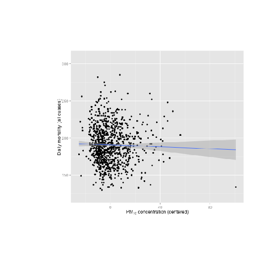
Last updated 2020-04-23 21:01:55.271179 IST

Manipulating Data with dplyr

setwd("C:/Users/kk/PortableApps/Git/home/k-allika/repos/DataScienceWithR/03_Getting_and_Cleaning_Data/Week03/workspace")
library(swirl)

| Hi! Type swirl() when you are ready to begin.

install_course("Getting and Cleaning Data")
|================================================================================| 100%

| Course installed successfully!

swirl()

| Welcome to swirl! Please sign in. If you've been here before, use the same name as you
| did then. If you are new, call yourself something unique.

What shall I call you? Krishnakanth Allika

| Please choose a course, or type 0 to exit swirl.

1: Getting and Cleaning Data
2: R Programming
3: Take me to the swirl course repository!

Selection: 1

| Please choose a lesson, or type 0 to return to course menu.

1: Manipulating Data with dplyr
2: Grouping and Chaining with dplyr
3: Tidying Data with tidyr
4: Dates and Times with lubridate

Selection: 1

| Attempting to load lesson dependencies...

| This lesson requires the ‘dplyr’ package. Would you like me to install it for you now?

1: Yes
2: No

Selection: 1

| Trying to install package ‘dplyr’ now...
also installing the dependencies ‘utf8’, ‘lifecycle’, ‘pillar’, ‘vctrs’, ‘purrr’, ‘pkgconfig’, ‘tibble’, ‘tidyselect’, ‘BH’, ‘plogr’

There is a binary version available but the source version is later:
binary source needs_compilation
tibble 3.0.0 3.0.1 TRUE

Binaries will be installed
package ‘utf8’ successfully unpacked and MD5 sums checked
package ‘lifecycle’ successfully unpacked and MD5 sums checked
package ‘pillar’ successfully unpacked and MD5 sums checked
package ‘vctrs’ successfully unpacked and MD5 sums checked
package ‘purrr’ successfully unpacked and MD5 sums checked
package ‘pkgconfig’ successfully unpacked and MD5 sums checked
package ‘tibble’ successfully unpacked and MD5 sums checked
package ‘tidyselect’ successfully unpacked and MD5 sums checked
package ‘BH’ successfully unpacked and MD5 sums checked
package ‘plogr’ successfully unpacked and MD5 sums checked
package ‘dplyr’ successfully unpacked and MD5 sums checked

| Package ‘dplyr’ loaded correctly!

| | 0%

| In this lesson, you'll learn how to manipulate data using dplyr. dplyr is a fast and
| powerful R package written by Hadley Wickham and Romain Francois that provides a
| consistent and concise grammar for manipulating tabular data.

...

|= | 2%
| One unique aspect of dplyr is that the same set of tools allow you to work with tabular
| data from a variety of sources, including data frames, data tables, databases and
| multidimensional arrays. In this lesson, we'll focus on data frames, but everything you
| learn will apply equally to other formats.

...

|=== | 3%
| As you may know, "CRAN is a network of ftp and web servers around the world that store
| identical, up-to-date, versions of code and documentation for R"
| (http://cran.rstudio.com/). RStudio maintains one of these so-called 'CRAN mirrors' and
| they generously make their download logs publicly available
| (http://cran-logs.rstudio.com/). We'll be working with the log from July 8, 2014, which
| contains information on roughly 225,000 package downloads.

...

|==== | 5%
| I've created a variable called path2csv, which contains the full file path to the
| dataset. Call read.csv() with two arguments, path2csv and stringsAsFactors = FALSE, and
| save the result in a new variable called mydf. Check ?read.csv if you need help.

mydf<-read.csv(path2csv,stringsAsFactors = FALSE)

| Excellent work!

|===== | 7%
| Use dim() to look at the dimensions of mydf.

dim(mydf)
[1] 225468 11

| You are doing so well!

|======= | 8%
| Now use head() to preview the data.

head(mydf)
X date time size r_version r_arch r_os package version country
1 1 2014-07-08 00:54:41 80589 3.1.0 x86_64 mingw32 htmltools 0.2.4 US
2 2 2014-07-08 00:59:53 321767 3.1.0 x86_64 mingw32 tseries 0.10-32 US
3 3 2014-07-08 00:47:13 748063 3.1.0 x86_64 linux-gnu party 1.0-15 US
4 4 2014-07-08 00:48:05 606104 3.1.0 x86_64 linux-gnu Hmisc 3.14-4 US
5 5 2014-07-08 00:46:50 79825 3.0.2 x86_64 linux-gnu digest 0.6.4 CA
6 6 2014-07-08 00:48:04 77681 3.1.0 x86_64 linux-gnu randomForest 4.6-7 US
ip_id
1 1
2 2
3 3
4 3
5 4
6 3

| Excellent work!

|======== | 10%
| The dplyr package was automatically installed (if necessary) and loaded at the
| beginning of this lesson. Normally, this is something you would have to do on your own.
| Just to build the habit, type library(dplyr) now to load the package again.

library(dplyr)

| Excellent work!

|========= | 12%
| It's important that you have dplyr version 0.4.0 or later. To confirm this, type
| packageVersion("dplyr").

packageVersion("dplyr")
[1] ‘0.8.5’

| Excellent work!

|=========== | 13%
| If your dplyr version is not at least 0.4.0, then you should hit the Esc key now,
| reinstall dplyr, then resume this lesson where you left off.

...

|============ | 15%
| The first step of working with data in dplyr is to load the data into what the package
| authors call a 'data frame tbl' or 'tbl_df'. Use the following code to create a new
| tbl_df called cran:
|
| cran <- tbl_df(mydf).

cran <- tbl_df(mydf)

| You are doing so well!

|============= | 17%
| To avoid confusion and keep things running smoothly, let's remove the original data
| frame from your workspace with rm("mydf").

rm("mydf")

| You are quite good my friend!

|=============== | 18%
| From ?tbl_df, "The main advantage to using a tbl_df over a regular data frame is the
| printing." Let's see what is meant by this. Type cran to print our tbl_df to the
| console.

cran
# A tibble: 225,468 x 11
X date time size r_version r_arch r_os package version country ip_id

1 1 2014-07~ 00:54:~ 80589 3.1.0 x86_64 mingw32 htmltools 0.2.4 US 1
2 2 2014-07~ 00:59:~ 321767 3.1.0 x86_64 mingw32 tseries 0.10-32 US 2
3 3 2014-07~ 00:47:~ 748063 3.1.0 x86_64 linux-~ party 1.0-15 US 3
4 4 2014-07~ 00:48:~ 606104 3.1.0 x86_64 linux-~ Hmisc 3.14-4 US 3
5 5 2014-07~ 00:46:~ 79825 3.0.2 x86_64 linux-~ digest 0.6.4 CA 4
6 6 2014-07~ 00:48:~ 77681 3.1.0 x86_64 linux-~ randomFo~ 4.6-7 US 3
7 7 2014-07~ 00:48:~ 393754 3.1.0 x86_64 linux-~ plyr 1.8.1 US 3
8 8 2014-07~ 00:47:~ 28216 3.0.2 x86_64 linux-~ whisker 0.3-2 US 5
9 9 2014-07~ 00:54:~ 5928 NA NA NA Rcpp 0.10.4 CN 6
10 10 2014-07~ 00:15:~ 2206029 3.0.2 x86_64 linux-~ hflights 0.1 US 7
# ... with 225,458 more rows

| All that hard work is paying off!

|================ | 20%
| This output is much more informative and compact than what we would get if we printed
| the original data frame (mydf) to the console.

...

|================= | 22%
| First, we are shown the class and dimensions of the dataset. Just below that, we get a
| preview of the data. Instead of attempting to print the entire dataset, dplyr just
| shows us the first 10 rows of data and only as many columns as fit neatly in our
| console. At the bottom, we see the names and classes for any variables that didn't fit
| on our screen.

...

|=================== | 23%
| According to the "Introduction to dplyr" vignette written by the package authors, "The
| dplyr philosophy is to have small functions that each do one thing well." Specifically,
| dplyr supplies five 'verbs' that cover most fundamental data manipulation tasks:
| select(), filter(), arrange(), mutate(), and summarize().

...

|==================== | 25%
| Use ?select to pull up the documentation for the first of these core functions.

?select

| Your dedication is inspiring!

|===================== | 27%
| Help files for the other functions are accessible in the same way.

...

|======================= | 28%
| As may often be the case, particularly with larger datasets, we are only interested in
| some of the variables. Use select(cran, ip_id, package, country) to select only the
| ip_id, package, and country variables from the cran dataset.

select(cran, ip_id, package, country)
# A tibble: 225,468 x 3
ip_id package country

1 1 htmltools US
2 2 tseries US
3 3 party US
4 3 Hmisc US
5 4 digest CA
6 3 randomForest US
7 3 plyr US
8 5 whisker US
9 6 Rcpp CN
10 7 hflights US
# ... with 225,458 more rows

| You are quite good my friend!

|======================== | 30%
| The first thing to notice is that we don't have to type cran$ip_id, cran$package, and
| cran$country, as we normally would when referring to columns of a data frame. The
| select() function knows we are referring to columns of the cran dataset.

...

|========================= | 32%
| Also, note that the columns are returned to us in the order we specified, even though
| ip_id is the rightmost column in the original dataset.

...

|=========================== | 33%
| Recall that in R, the : operator provides a compact notation for creating a sequence
| of numbers. For example, try 5:20.

5:20
[1] 5 6 7 8 9 10 11 12 13 14 15 16 17 18 19 20

| All that practice is paying off!

|============================ | 35%
| Normally, this notation is reserved for numbers, but select() allows you to specify a
| sequence of columns this way, which can save a bunch of typing. Use select(cran,
| r_arch:country) to select all columns starting from r_arch and ending with country.

select(cran,r_arch:country)
# A tibble: 225,468 x 5
r_arch r_os package version country

1 x86_64 mingw32 htmltools 0.2.4 US
2 x86_64 mingw32 tseries 0.10-32 US
3 x86_64 linux-gnu party 1.0-15 US
4 x86_64 linux-gnu Hmisc 3.14-4 US
5 x86_64 linux-gnu digest 0.6.4 CA
6 x86_64 linux-gnu randomForest 4.6-7 US
7 x86_64 linux-gnu plyr 1.8.1 US
8 x86_64 linux-gnu whisker 0.3-2 US
9 NA NA Rcpp 0.10.4 CN
10 x86_64 linux-gnu hflights 0.1 US
# ... with 225,458 more rows

| You are quite good my friend!

|============================= | 37%
| We can also select the same columns in reverse order. Give it a try.

select(cran,country:r_arch)
# A tibble: 225,468 x 5
country version package r_os r_arch

1 US 0.2.4 htmltools mingw32 x86_64
2 US 0.10-32 tseries mingw32 x86_64
3 US 1.0-15 party linux-gnu x86_64
4 US 3.14-4 Hmisc linux-gnu x86_64
5 CA 0.6.4 digest linux-gnu x86_64
6 US 4.6-7 randomForest linux-gnu x86_64
7 US 1.8.1 plyr linux-gnu x86_64
8 US 0.3-2 whisker linux-gnu x86_64
9 CN 0.10.4 Rcpp NA NA
10 US 0.1 hflights linux-gnu x86_64
# ... with 225,458 more rows

| You're the best!

|=============================== | 38%
| Print the entire dataset again, just to remind yourself of what it looks like. You can
| do this at anytime during the lesson.

cran
# A tibble: 225,468 x 11
X date time size r_version r_arch r_os package version country ip_id

1 1 2014-07~ 00:54:~ 80589 3.1.0 x86_64 mingw32 htmltools 0.2.4 US 1
2 2 2014-07~ 00:59:~ 321767 3.1.0 x86_64 mingw32 tseries 0.10-32 US 2
3 3 2014-07~ 00:47:~ 748063 3.1.0 x86_64 linux-~ party 1.0-15 US 3
4 4 2014-07~ 00:48:~ 606104 3.1.0 x86_64 linux-~ Hmisc 3.14-4 US 3
5 5 2014-07~ 00:46:~ 79825 3.0.2 x86_64 linux-~ digest 0.6.4 CA 4
6 6 2014-07~ 00:48:~ 77681 3.1.0 x86_64 linux-~ randomFo~ 4.6-7 US 3
7 7 2014-07~ 00:48:~ 393754 3.1.0 x86_64 linux-~ plyr 1.8.1 US 3
8 8 2014-07~ 00:47:~ 28216 3.0.2 x86_64 linux-~ whisker 0.3-2 US 5
9 9 2014-07~ 00:54:~ 5928 NA NA NA Rcpp 0.10.4 CN 6
10 10 2014-07~ 00:15:~ 2206029 3.0.2 x86_64 linux-~ hflights 0.1 US 7
# ... with 225,458 more rows

| Keep working like that and you'll get there!

|================================ | 40%
| Instead of specifying the columns we want to keep, we can also specify the columns we
| want to throw away. To see how this works, do select(cran, -time) to omit the time
| column.

select(cran,-time)
# A tibble: 225,468 x 10
X date size r_version r_arch r_os package version country ip_id

1 1 2014-07-08 80589 3.1.0 x86_64 mingw32 htmltools 0.2.4 US 1
2 2 2014-07-08 321767 3.1.0 x86_64 mingw32 tseries 0.10-32 US 2
3 3 2014-07-08 748063 3.1.0 x86_64 linux-gnu party 1.0-15 US 3
4 4 2014-07-08 606104 3.1.0 x86_64 linux-gnu Hmisc 3.14-4 US 3
5 5 2014-07-08 79825 3.0.2 x86_64 linux-gnu digest 0.6.4 CA 4
6 6 2014-07-08 77681 3.1.0 x86_64 linux-gnu randomForest 4.6-7 US 3
7 7 2014-07-08 393754 3.1.0 x86_64 linux-gnu plyr 1.8.1 US 3
8 8 2014-07-08 28216 3.0.2 x86_64 linux-gnu whisker 0.3-2 US 5
9 9 2014-07-08 5928 NA NA NA Rcpp 0.10.4 CN 6
10 10 2014-07-08 2206029 3.0.2 x86_64 linux-gnu hflights 0.1 US 7
# ... with 225,458 more rows

| You are doing so well!

|================================= | 42%
| The negative sign in front of time tells select() that we DON'T want the time column.
| Now, let's combine strategies to omit all columns from X through size (X:size). To see
| how this might work, let's look at a numerical example with -5:20.

-5:20
[1] -5 -4 -3 -2 -1 0 1 2 3 4 5 6 7 8 9 10 11 12 13 14 15 16 17 18 19 20

| Your dedication is inspiring!

|=================================== | 43%
| Oops! That gaves us a vector of numbers from -5 through 20, which is not what we want.
| Instead, we want to negate the entire sequence of numbers from 5 through 20, so that we
| get -5, -6, -7, ... , -18, -19, -20. Try the same thing, except surround 5:20 with
| parentheses so that R knows we want it to first come up with the sequence of numbers,
| then apply the negative sign to the whole thing.

-(5:20)
[1] -5 -6 -7 -8 -9 -10 -11 -12 -13 -14 -15 -16 -17 -18 -19 -20

| You're the best!

|==================================== | 45%
| Use this knowledge to omit all columns X:size using select().

select(cran,-(X:size))
# A tibble: 225,468 x 7
r_version r_arch r_os package version country ip_id

1 3.1.0 x86_64 mingw32 htmltools 0.2.4 US 1
2 3.1.0 x86_64 mingw32 tseries 0.10-32 US 2
3 3.1.0 x86_64 linux-gnu party 1.0-15 US 3
4 3.1.0 x86_64 linux-gnu Hmisc 3.14-4 US 3
5 3.0.2 x86_64 linux-gnu digest 0.6.4 CA 4
6 3.1.0 x86_64 linux-gnu randomForest 4.6-7 US 3
7 3.1.0 x86_64 linux-gnu plyr 1.8.1 US 3
8 3.0.2 x86_64 linux-gnu whisker 0.3-2 US 5
9 NA NA NA Rcpp 0.10.4 CN 6
10 3.0.2 x86_64 linux-gnu hflights 0.1 US 7
# ... with 225,458 more rows

| You got it right!

|===================================== | 47%
| Now that you know how to select a subset of columns using select(), a natural next
| question is "How do I select a subset of rows?" That's where the filter() function
| comes in.

...

|======================================= | 48%
| Use filter(cran, package == "swirl") to select all rows for which the package variable
| is equal to "swirl". Be sure to use two equals signs side-by-side!

filter(cran,package=="swirl")
# A tibble: 820 x 11
X date time size r_version r_arch r_os package version country ip_id

1 27 2014-07-~ 00:17:~ 105350 3.0.2 x86_64 mingw32 swirl 2.2.9 US 20
2 156 2014-07-~ 00:22:~ 41261 3.1.0 x86_64 linux-gnu swirl 2.2.9 US 66
3 358 2014-07-~ 00:13:~ 105335 2.15.2 x86_64 mingw32 swirl 2.2.9 CA 115
4 593 2014-07-~ 00:59:~ 105465 3.1.0 x86_64 darwin13~ swirl 2.2.9 MX 162
5 831 2014-07-~ 00:55:~ 105335 3.0.3 x86_64 mingw32 swirl 2.2.9 US 57
6 997 2014-07-~ 00:33:~ 41261 3.1.0 x86_64 mingw32 swirl 2.2.9 US 70
7 1023 2014-07-~ 00:35:~ 106393 3.1.0 x86_64 mingw32 swirl 2.2.9 BR 248
8 1144 2014-07-~ 00:00:~ 106534 3.0.2 x86_64 linux-gnu swirl 2.2.9 US 261
9 1402 2014-07-~ 00:41:~ 41261 3.1.0 i386 mingw32 swirl 2.2.9 US 234
10 1424 2014-07-~ 00:44:~ 106393 3.1.0 x86_64 linux-gnu swirl 2.2.9 US 301
# ... with 810 more rows

| Great job!

|======================================== | 50%
| Again, note that filter() recognizes 'package' as a column of cran, without you having
| to explicitly specify cran$package.

...

|========================================= | 52%
| The == operator asks whether the thing on the left is equal to the thing on the right.
| If yes, then it returns TRUE. If no, then FALSE. In this case, package is an entire
| vector (column) of values, so package == "swirl" returns a vector of TRUEs and FALSEs.
| filter() then returns only the rows of cran corresponding to the TRUEs.

...

|=========================================== | 53%
| You can specify as many conditions as you want, separated by commas. For example
| filter(cran, r_version == "3.1.1", country == "US") will return all rows of cran
| corresponding to downloads from users in the US running R version 3.1.1. Try it out.

filter(cran, r_version == "3.1.1", country == "US")
# A tibble: 1,588 x 11
X date time size r_version r_arch r_os package version country ip_id

1 2216 2014-07~ 00:48:~ 3.85e5 3.1.1 x86_64 darwin1~ colorspa~ 1.2-4 US 191
2 17332 2014-07~ 03:39:~ 1.97e5 3.1.1 x86_64 darwin1~ httr 0.3 US 1704
3 17465 2014-07~ 03:25:~ 2.33e4 3.1.1 x86_64 darwin1~ snow 0.3-13 US 62
4 18844 2014-07~ 03:59:~ 1.91e5 3.1.1 x86_64 darwin1~ maxLik 1.2-0 US 1533
5 30182 2014-07~ 04:13:~ 7.77e4 3.1.1 i386 mingw32 randomFo~ 4.6-7 US 646
6 30193 2014-07~ 04:06:~ 2.35e6 3.1.1 i386 mingw32 ggplot2 1.0.0 US 8
7 30195 2014-07~ 04:07:~ 2.99e5 3.1.1 i386 mingw32 fExtremes 3010.81 US 2010
8 30217 2014-07~ 04:32:~ 5.68e5 3.1.1 i386 mingw32 rJava 0.9-6 US 98
9 30245 2014-07~ 04:10:~ 5.27e5 3.1.1 i386 mingw32 LPCM 0.44-8 US 8
10 30354 2014-07~ 04:32:~ 1.76e6 3.1.1 i386 mingw32 mgcv 1.8-1 US 2122
# ... with 1,578 more rows

| That's a job well done!

|============================================ | 55%
| The conditions passed to filter() can make use of any of the standard comparison
| operators. Pull up the relevant documentation with ?Comparison (that's an uppercase C).

?Comparison

| You are quite good my friend!

|============================================= | 57%
| Edit your previous call to filter() to instead return rows corresponding to users in
| "IN" (India) running an R version that is less than or equal to "3.0.2". The up arrow
| on your keyboard may come in handy here. Don't forget your double quotes!

filter(cran, r_version <= "3.0.2", country == "IN")
# A tibble: 4,139 x 11
X date time size r_version r_arch r_os package version country ip_id

1 348 2014-07~ 00:44:~ 1.02e7 3.0.0 x86_64 mingw32 BH 1.54.0~ IN 112
2 9990 2014-07~ 02:11:~ 3.97e5 3.0.2 x86_64 linux-~ equateIRT 1.1 IN 1054
3 9991 2014-07~ 02:11:~ 1.19e5 3.0.2 x86_64 linux-~ ggdendro 0.1-14 IN 1054
4 9992 2014-07~ 02:11:~ 8.18e4 3.0.2 x86_64 linux-~ dfcrm 0.2-2 IN 1054
5 10022 2014-07~ 02:19:~ 1.56e6 2.15.0 x86_64 mingw32 RcppArma~ 0.4.32~ IN 1060
6 10023 2014-07~ 02:19:~ 1.18e6 2.15.1 i686 linux-~ forecast 5.4 IN 1060
7 10189 2014-07~ 02:38:~ 9.09e5 3.0.2 x86_64 linux-~ editrules 2.7.2 IN 1054
8 10199 2014-07~ 02:38:~ 1.78e5 3.0.2 x86_64 linux-~ energy 1.6.1 IN 1054
9 10200 2014-07~ 02:38:~ 5.18e4 3.0.2 x86_64 linux-~ ENmisc 1.2-7 IN 1054
10 10201 2014-07~ 02:38:~ 6.52e4 3.0.2 x86_64 linux-~ entropy 1.2.0 IN 1054
# ... with 4,129 more rows

| Excellent work!

|=============================================== | 58%
| Our last two calls to filter() requested all rows for which some condition AND another
| condition were TRUE. We can also request rows for which EITHER one condition OR another
| condition are TRUE. For example, filter(cran, country == "US" | country == "IN") will
| gives us all rows for which the country variable equals either "US" or "IN". Give it a
| go.

filter(cran, country == "US | country == "IN")
Error: unexpected symbol in "filter(cran, country == "US | country == "IN"
filter(cran, country == "US" | country == "IN")
# A tibble: 95,283 x 11
X date time size r_version r_arch r_os package version country ip_id

1 1 2014-07~ 00:54:~ 80589 3.1.0 x86_64 mingw32 htmltools 0.2.4 US 1
2 2 2014-07~ 00:59:~ 321767 3.1.0 x86_64 mingw32 tseries 0.10-32 US 2
3 3 2014-07~ 00:47:~ 748063 3.1.0 x86_64 linux-~ party 1.0-15 US 3
4 4 2014-07~ 00:48:~ 606104 3.1.0 x86_64 linux-~ Hmisc 3.14-4 US 3
5 6 2014-07~ 00:48:~ 77681 3.1.0 x86_64 linux-~ randomFo~ 4.6-7 US 3
6 7 2014-07~ 00:48:~ 393754 3.1.0 x86_64 linux-~ plyr 1.8.1 US 3
7 8 2014-07~ 00:47:~ 28216 3.0.2 x86_64 linux-~ whisker 0.3-2 US 5
8 10 2014-07~ 00:15:~ 2206029 3.0.2 x86_64 linux-~ hflights 0.1 US 7
9 11 2014-07~ 00:15:~ 526858 3.0.2 x86_64 linux-~ LPCM 0.44-8 US 8
10 12 2014-07~ 00:14:~ 2351969 2.14.1 x86_64 linux-~ ggplot2 1.0.0 US 8
# ... with 95,273 more rows

| Your dedication is inspiring!

|================================================ | 60%
| Now, use filter() to fetch all rows for which size is strictly greater than (>) 100500
| (no quotes, since size is numeric) AND r_os equals "linux-gnu". Hint: You are passing
| three arguments to filter(): the name of the dataset, the first condition, and the
| second condition.

filter(cran,size>100500,r_os=="linux-gnu")
# A tibble: 33,683 x 11
X date time size r_version r_arch r_os package version country ip_id

1 3 2014-07-~ 00:47:13 748063 3.1.0 x86_64 linux-~ party 1.0-15 US 3
2 4 2014-07-~ 00:48:05 606104 3.1.0 x86_64 linux-~ Hmisc 3.14-4 US 3
3 7 2014-07-~ 00:48:35 393754 3.1.0 x86_64 linux-~ plyr 1.8.1 US 3
4 10 2014-07-~ 00:15:35 2206029 3.0.2 x86_64 linux-~ hfligh~ 0.1 US 7
5 11 2014-07-~ 00:15:25 526858 3.0.2 x86_64 linux-~ LPCM 0.44-8 US 8
6 12 2014-07-~ 00:14:45 2351969 2.14.1 x86_64 linux-~ ggplot2 1.0.0 US 8
7 14 2014-07-~ 00:15:35 3097729 3.0.2 x86_64 linux-~ Rcpp 0.9.7 VE 10
8 15 2014-07-~ 00:14:37 568036 3.1.0 x86_64 linux-~ rJava 0.9-6 US 11
9 16 2014-07-~ 00:15:50 1600441 3.1.0 x86_64 linux-~ RSQLite 0.11.4 US 7
10 18 2014-07-~ 00:26:59 186685 3.1.0 x86_64 linux-~ ipred 0.9-3 DE 13
# ... with 33,673 more rows

| You're the best!

|================================================= | 62%
| Finally, we want to get only the rows for which the r_version is not missing. R
| represents missing values with NA and these missing values can be detected using the
| is.na() function.

...

|=================================================== | 63%
| To see how this works, try is.na(c(3, 5, NA, 10)).

is.na(c(3,5,NA,10))
[1] FALSE FALSE TRUE FALSE

| All that hard work is paying off!

|==================================================== | 65%
| Now, put an exclamation point (!) before is.na() to change all of the TRUEs to FALSEs
| and all of the FALSEs to TRUEs, thus telling us what is NOT NA: !is.na(c(3, 5, NA,
| 10)).

!is.na(c(3,5,NA,10))
[1] TRUE TRUE FALSE TRUE

| Keep up the great work!

|===================================================== | 67%
| Okay, ready to put all of this together? Use filter() to return all rows of cran for
| which r_version is NOT NA. Hint: You will need to use !is.na() as part of your second
| argument to filter().

filter(cran,!is.na(r_version))
# A tibble: 207,205 x 11
X date time size r_version r_arch r_os package version country ip_id

1 1 2014-07~ 00:54:~ 80589 3.1.0 x86_64 mingw32 htmltools 0.2.4 US 1
2 2 2014-07~ 00:59:~ 321767 3.1.0 x86_64 mingw32 tseries 0.10-32 US 2
3 3 2014-07~ 00:47:~ 748063 3.1.0 x86_64 linux-~ party 1.0-15 US 3
4 4 2014-07~ 00:48:~ 606104 3.1.0 x86_64 linux-~ Hmisc 3.14-4 US 3
5 5 2014-07~ 00:46:~ 79825 3.0.2 x86_64 linux-~ digest 0.6.4 CA 4
6 6 2014-07~ 00:48:~ 77681 3.1.0 x86_64 linux-~ randomFo~ 4.6-7 US 3
7 7 2014-07~ 00:48:~ 393754 3.1.0 x86_64 linux-~ plyr 1.8.1 US 3
8 8 2014-07~ 00:47:~ 28216 3.0.2 x86_64 linux-~ whisker 0.3-2 US 5
9 10 2014-07~ 00:15:~ 2206029 3.0.2 x86_64 linux-~ hflights 0.1 US 7
10 11 2014-07~ 00:15:~ 526858 3.0.2 x86_64 linux-~ LPCM 0.44-8 US 8
# ... with 207,195 more rows

| All that practice is paying off!

|======================================================= | 68%
| We've seen how to select a subset of columns and rows from our dataset using select()
| and filter(), respectively. Inherent in select() was also the ability to arrange our
| selected columns in any order we please.

...

|======================================================== | 70%
| Sometimes we want to order the rows of a dataset according to the values of a
| particular variable. This is the job of arrange().

...

|========================================================= | 72%
| To see how arrange() works, let's first take a subset of cran. select() all columns
| from size through ip_id and store the result in cran2.

cran2<-select(cran,size:ip_id)

| Excellent work!

|=========================================================== | 73%
| Now, to order the ROWS of cran2 so that ip_id is in ascending order (from small to
| large), type arrange(cran2, ip_id). You may want to make your console wide enough so
| that you can see ip_id, which is the last column.

arrange(cran2,ip_id)
# A tibble: 225,468 x 8
size r_version r_arch r_os package version country ip_id

1 80589 3.1.0 x86_64 mingw32 htmltools 0.2.4 US 1
2 180562 3.0.2 x86_64 mingw32 yaml 2.1.13 US 1
3 190120 3.1.0 i386 mingw32 babel 0.2-6 US 1
4 321767 3.1.0 x86_64 mingw32 tseries 0.10-32 US 2
5 52281 3.0.3 x86_64 darwin10.8.0 quadprog 1.5-5 US 2
6 876702 3.1.0 x86_64 linux-gnu zoo 1.7-11 US 2
7 321764 3.0.2 x86_64 linux-gnu tseries 0.10-32 US 2
8 876702 3.1.0 x86_64 linux-gnu zoo 1.7-11 US 2
9 321768 3.1.0 x86_64 mingw32 tseries 0.10-32 US 2
10 784093 3.1.0 x86_64 linux-gnu strucchange 1.5-0 US 2
# ... with 225,458 more rows

| Perseverance, that's the answer.

|============================================================ | 75%
| To do the same, but in descending order, change the second argument to desc(ip_id),
| where desc() stands for 'descending'. Go ahead.

arrange(cran2,desc(ip_id))
# A tibble: 225,468 x 8
size r_version r_arch r_os package version country ip_id

1 5933 NA NA NA CPE 1.4.2 CN 13859
2 569241 3.1.0 x86_64 mingw32 multcompView 0.1-5 US 13858
3 228444 3.1.0 x86_64 mingw32 tourr 0.5.3 NZ 13857
4 308962 3.1.0 x86_64 darwin13.1.0 ctv 0.7-9 CN 13856
5 950964 3.0.3 i386 mingw32 knitr 1.6 CA 13855
6 80185 3.0.3 i386 mingw32 htmltools 0.2.4 CA 13855
7 1431750 3.0.3 i386 mingw32 shiny 0.10.0 CA 13855
8 2189695 3.1.0 x86_64 mingw32 RMySQL 0.9-3 US 13854
9 4818024 3.1.0 i386 mingw32 igraph 0.7.1 US 13853
10 197495 3.1.0 x86_64 mingw32 coda 0.16-1 US 13852
# ... with 225,458 more rows

| You're the best!

|============================================================= | 77%
| We can also arrange the data according to the values of multiple variables. For
| example, arrange(cran2, package, ip_id) will first arrange by package names (ascending
| alphabetically), then by ip_id. This means that if there are multiple rows with the
| same value for package, they will be sorted by ip_id (ascending numerically). Try
| arrange(cran2, package, ip_id) now.

arrange(cran2,package,ip_id)
# A tibble: 225,468 x 8
size r_version r_arch r_os package version country ip_id

1 71677 3.0.3 x86_64 darwin10.8.0 A3 0.9.2 CN 1003
2 71672 3.1.0 x86_64 linux-gnu A3 0.9.2 US 1015
3 71677 3.1.0 x86_64 mingw32 A3 0.9.2 IN 1054
4 70438 3.0.1 x86_64 darwin10.8.0 A3 0.9.2 CN 1513
5 71677 NA NA NA A3 0.9.2 BR 1526
6 71892 3.0.2 x86_64 linux-gnu A3 0.9.2 IN 1542
7 71677 3.1.0 x86_64 linux-gnu A3 0.9.2 ZA 2925
8 71672 3.1.0 x86_64 mingw32 A3 0.9.2 IL 3889
9 71677 3.0.3 x86_64 mingw32 A3 0.9.2 DE 3917
10 71672 3.1.0 x86_64 mingw32 A3 0.9.2 US 4219
# ... with 225,458 more rows

| You got it!

|=============================================================== | 78%
| Arrange cran2 by the following three variables, in this order: country (ascending),
| r_version (descending), and ip_id (ascending).

arrange(cran2,country,desc(r_version),ip_id)
# A tibble: 225,468 x 8
size r_version r_arch r_os package version country ip_id

1 1556858 3.1.1 i386 mingw32 RcppArmadillo 0.4.320.0 A1 2843
2 1823512 3.1.0 x86_64 linux-gnu mgcv 1.8-1 A1 2843
3 15732 3.1.0 i686 linux-gnu grnn 0.1.0 A1 3146
4 3014840 3.1.0 x86_64 mingw32 Rcpp 0.11.2 A1 3146
5 660087 3.1.0 i386 mingw32 xts 0.9-7 A1 3146
6 522261 3.1.0 i386 mingw32 FNN 1.1 A1 3146
7 522263 3.1.0 i386 mingw32 FNN 1.1 A1 3146
8 1676627 3.1.0 x86_64 linux-gnu rgeos 0.3-5 A1 3146
9 2118530 3.1.0 x86_64 linux-gnu spacetime 1.1-0 A1 3146
10 2217180 3.1.0 x86_64 mingw32 gstat 1.0-19 A1 3146
# ... with 225,458 more rows

| All that practice is paying off!

|================================================================ | 80%
| To illustrate the next major function in dplyr, let's take another subset of our
| original data. Use select() to grab 3 columns from cran -- ip_id, package, and size (in
| that order) -- and store the result in a new variable called cran3.

cran3<-select(cran,ip_is,package,size)
Error: Can't subset columns that don't exist.
x The column ip_is doesn't exist.
Run rlang::last_error() to see where the error occurred.
cran3<-select(cran,ip_id,package,size)

| You are really on a roll!

|================================================================= | 82%
| Take a look at cran3 now.

cran3
# A tibble: 225,468 x 3
ip_id package size

1 1 htmltools 80589
2 2 tseries 321767
3 3 party 748063
4 3 Hmisc 606104
5 4 digest 79825
6 3 randomForest 77681
7 3 plyr 393754
8 5 whisker 28216
9 6 Rcpp 5928
10 7 hflights 2206029
# ... with 225,458 more rows

| Your dedication is inspiring!

|=================================================================== | 83%
| It's common to create a new variable based on the value of one or more variables
| already in a dataset. The mutate() function does exactly this.

...

|==================================================================== | 85%
| The size variable represents the download size in bytes, which are units of computer
| memory. These days, megabytes (MB) are a more common unit of measurement. One megabyte
| is equal to 2^20 bytes. That's 2 to the power of 20, which is approximately one million
| bytes!

...

|===================================================================== | 87%
| We want to add a column called size_mb that contains the download size in megabytes.
| Here's the code to do it:
|
| mutate(cran3, size_mb = size / 2^20)

mutate(cran3, size_mb = size / 2^20)
# A tibble: 225,468 x 4
ip_id package size size_mb

1 1 htmltools 80589 0.0769
2 2 tseries 321767 0.307
3 3 party 748063 0.713
4 3 Hmisc 606104 0.578
5 4 digest 79825 0.0761
6 3 randomForest 77681 0.0741
7 3 plyr 393754 0.376
8 5 whisker 28216 0.0269
9 6 Rcpp 5928 0.00565
10 7 hflights 2206029 2.10
# ... with 225,458 more rows

| You are really on a roll!

|======================================================================= | 88%
| An even larger unit of memory is a gigabyte (GB), which equals 2^10 megabytes. We might
| as well add another column for download size in gigabytes!

...

|======================================================================== | 90%
| One very nice feature of mutate() is that you can use the value computed for your
| second column (size_mb) to create a third column, all in the same line of code. To see
| this in action, repeat the exact same command as above, except add a third argument
| creating a column that is named size_gb and equal to size_mb / 2^10.

mutate(cran3, size_mb = size / 2^20, size_gb = size_mb / 2^10)
# A tibble: 225,468 x 5
ip_id package size size_mb size_gb

1 1 htmltools 80589 0.0769 0.0000751
2 2 tseries 321767 0.307 0.000300
3 3 party 748063 0.713 0.000697
4 3 Hmisc 606104 0.578 0.000564
5 4 digest 79825 0.0761 0.0000743
6 3 randomForest 77681 0.0741 0.0000723
7 3 plyr 393754 0.376 0.000367
8 5 whisker 28216 0.0269 0.0000263
9 6 Rcpp 5928 0.00565 0.00000552
10 7 hflights 2206029 2.10 0.00205
# ... with 225,458 more rows

| That's correct!

|========================================================================= | 92%
| Let's try one more for practice. Pretend we discovered a glitch in the system that
| provided the original values for the size variable. All of the values in cran3 are 1000
| bytes less than they should be. Using cran3, create just one new column called
| correct_size that contains the correct size.


mutate(cran3, correct_size=size+1000)
# A tibble: 225,468 x 4
ip_id package size correct_size

1 1 htmltools 80589 81589
2 2 tseries 321767 322767
3 3 party 748063 749063
4 3 Hmisc 606104 607104
5 4 digest 79825 80825
6 3 randomForest 77681 78681
7 3 plyr 393754 394754
8 5 whisker 28216 29216
9 6 Rcpp 5928 6928
10 7 hflights 2206029 2207029
# ... with 225,458 more rows

| You're the best!

|=========================================================================== | 93%
| The last of the five core dplyr verbs, summarize(), collapses the dataset to a single
| row. Let's say we're interested in knowing the average download size. summarize(cran,
| avg_bytes = mean(size)) will yield the mean value of the size variable. Here we've
| chosen to label the result 'avg_bytes', but we could have named it anything. Give it a
| try.

summarize(cran,avg_bytes=mean(size))
# A tibble: 1 x 1
avg_bytes

1 844086.

| You are doing so well!

|============================================================================ | 95%
| That's not particularly interesting. summarize() is most useful when working with data
| that has been grouped by the values of a particular variable.

...

|============================================================================= | 97%
| We'll look at grouped data in the next lesson, but the idea is that summarize() can
| give you the requested value FOR EACH group in your dataset.

...

|=============================================================================== | 98%
| In this lesson, you learned how to manipulate data using dplyr's five main functions.
| In the next lesson, we'll look at how to take advantage of some other useful features
| of dplyr to make your life as a data analyst much easier.

...

|================================================================================| 100%
| Would you like to receive credit for completing this course on Coursera.org?

1: No
2: Yes

Selection: 2
What is your email address? xxxxxx@xxxxxxxxxxxx
What is your assignment token? xXxXxxXXxXxxXXXx
Grade submission succeeded!

| You are really on a roll!

| You've reached the end of this lesson! Returning to the main menu...

| Please choose a course, or type 0 to exit swirl.

1: Getting and Cleaning Data
2: R Programming
3: Take me to the swirl course repository!

Selection: 0

| Leaving swirl now. Type swirl() to resume.

ls()
[1] "cran" "cran2" "cran3" "path2csv"
rm(list=ls())
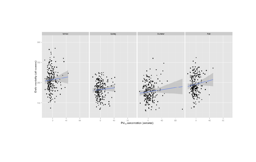
Last updated 2020-04-23 20:35:34.926750 IST

Air Pollution data

Introduction

Data
The zip file containing the data can be downloaded here:

AirPollution.zip (2.67MB)

The zip file contains 332 comma-separated-value (CSV) files containing pollution monitoring data for fine particulate matter (PM) air pollution at 332 locations in the United States. Each file contains data from a single monitor and the ID number for each monitor is contained in the file name. For example, data for monitor 200 is contained in the file "200.csv". Each file contains three variables:

Date: the date of the observation in YYYY-MM-DD format (year-month-day)
sulfate: the level of sulfate PM in the air on that date (measured in micrograms per cubic meter)
nitrate: the level of nitrate PM in the air on that date (measured in micrograms per cubic meter)

This data will be used in the following functions. The goal is load data from these files without dowloading or storing them in the hard disk drive, but be available to the functions to woek on them.

In [7]:
# Create an empty file in memory
file<-tempfile()
# Download the zip file to this empty file
download.file("http://link.datascience.eu.org/p004d1",file,mode="wb")
In [10]:
# Check data file format
head(unzip(file,list=TRUE))
Name Length Date
data/ 0 2012-09-22 00:27:00
data/001.csv 31271 2012-09-22 01:30:00
data/002.csv 81435 2012-09-22 01:30:00
data/003.csv 47185 2012-09-22 01:30:00
data/004.csv 78887 2012-09-22 01:30:00
data/005.csv 63204 2012-09-22 01:30:00

[^top]

Function 1: Mean, Median, Mode, Standard Deviation

The function "PollutantStats" will calculate the mean, median, mode and standard deviation of a pollutant (sulfate or nitrate) across a specified list of monitors.

Input
The function "PollutantStats" accepts two arguments:

  1. "pollutant" - Pollutant name sulfate or nitrate
  2. "id" - An optional Monitor id vector. Default value is 1:332.

Output
Mean, median, mode and standard deviation of the pollutant.

In [19]:
PollutantStats<-function(pollutant,id=1:332){
    # Initialize empty vectors.
    p<-c()    # Pollutant vector
    # Loop through each file number.
    for (i in id){
        # We need to have the file path in "data/001.csv" format to use read.csv() function.
        # Use sprintf to combine directory name and file number in required format.
        df<-read.csv(unz(file,sprintf("data/%03d.csv",i)))
        # Using a comma in df[,pollutant] converts it into a numeric vector.
        # Else it remains a dataframe and pollutant_vector becomes a list.
        p<-c(p,df[,pollutant])
    }
    # Calculate mean, median, mode and SD excluding missing values.
    Mean<-mean(p,na.rm=TRUE)
    Median<-mean(p,na.rm=TRUE)
    Mode<-names(table(p))[table(p)==max(table(p))]
    SD<-sd(p,na.rm=TRUE)
    data.frame(Pollutant=pollutant,Mean=Mean,Median=Median,Mode=Mode,Std_dev=SD)
}
In [21]:
PollutantStats("sulfate",1:12)
Pollutant Mean Median Mode Std_dev
sulfate 3.765641 3.765641 2.84 2.874151
In [22]:
PollutantStats("nitrate",74:80)
Pollutant Mean Median Mode Std_dev
nitrate 2.611021 2.611021 1.24 2.802195
In [24]:
PollutantStats("sulfate",10)
Pollutant Mean Median Mode Std_dev
sulfate 0.6243649 0.6243649 0.349 0.3637092
In [25]:
PollutantStats("nitrate")
Pollutant Mean Median Mode Std_dev
nitrate 1.702932 1.702932 1.1 2.52504

[^top]

Function 2: Data Quality

The function "DataQuality" will report the quality of data for each monitor ID.

Input
The function accepts one argument:

  1. "id" - An optional Monitor id vector. Default value is 1:332.

Output

  1. id: Monitor ID
  2. Obs: Total number of valid and invalid observations for the corresponding monitor ID (including missing values)
  3. Sulfate, Nitrate: Number of valid data points of each pollutant.
  4. SulfateQ, NitrateQ: Percentage of valid data points of each pollutant.
  5. PairWise: Number of valid data points of both pollutants together.
  6. PairWiseQ: Percentafe of valid data points of both pollutants together
In [86]:
DataQuality<-function(id=1:332){
    p<-c("sulfate","nitrate")
    # Create an empty data frame
    x=integer()
    q<-data.frame(id=x,Obs=x,Sulfate=x,Nitrate=x,PairWise=x)
    for (i in id){
        # Reading each csv file into a dataframe.
        df<-read.csv(unz(file,sprintf("data/%03d.csv",i)))
        obs<-nrow(df)
        sulfate<-nrow(df[!(is.na(df[p[1]])),])
        nitrate<-nrow(df[!(is.na(df[p[2]])),])
        pairwise<-nrow(df[!(is.na(df[p[1]])|is.na(df[p[2]])),])
        q[nrow(q)+1,]<-c(i,obs,sulfate,nitrate,pairwise)
    }
    # Add SulfateQ, NitrateQ and PairWiseQ columns.
    q$SulfateQ<-round(q$Sulfate/q$Obs*100,1)
    q$NitrateQ<-round(q$Nitrate/q$Obs*100,1)
    q$PairWiseQ<-round(q$PairWise/q$Obs*100,1)
    q
}
In [87]:
DataQuality(1)
id Obs Sulfate Nitrate PairWise SulfateQ NitrateQ PairWiseQ
1 1461 117 122 117 8 8.4 8
In [88]:
DataQuality(c(5,10,15,20,15))
id Obs Sulfate Nitrate PairWise SulfateQ NitrateQ PairWiseQ
5 2922 402 405 402 13.8 13.9 13.8
10 1096 148 183 148 13.5 16.7 13.5
15 730 83 85 83 11.4 11.6 11.4
20 1461 124 128 124 8.5 8.8 8.5
15 730 83 85 83 11.4 11.6 11.4
In [89]:
DataQuality(44:40)
id Obs Sulfate Nitrate PairWise SulfateQ NitrateQ PairWiseQ
44 2557 283 287 283 11.1 11.2 11.1
43 1095 74 77 74 6.8 7.0 6.8
42 1095 60 68 60 5.5 6.2 5.5
41 2556 227 243 227 8.9 9.5 8.9
40 365 21 21 21 5.8 5.8 5.8
In [90]:
dq<-DataQuality()
In [91]:
summary(dq$PairWiseQ)
   Min. 1st Qu.  Median    Mean 3rd Qu.    Max. 
   0.00    9.90   12.30   12.98   15.32   41.10 

[^top]

Function 3: Correlation Test

The "Correlation" function will calculate the correlation coefficient and significance(correlation test) between the pollutants Sulfate and Nitrate for a range of minitor ids that meet required pair wise data quality.

Input

  1. pwq - Pair wise data quality in percentage. Default value is 0.
  2. id - An optional Monitor id vector. Default value is 1:332.

Output

  1. Pearson correlation test summary
In [128]:
Correlation<-function(pwq=0,id=1:332){
    p<-c("sulfate","nitrate")
    # Init empty data frame
    dfc<-as.data.frame(setNames(replicate(2,numeric(0), simplify = F), p))
    for (i in id){
        # Reading each csv file into a dataframe.
        df<-read.csv(unz(file,sprintf("data/%03d.csv",i)))
        # Pairwise complete obserations
        dfpw<-df[!(is.na(df[p[1]])|is.na(df[p[2]])),]
        # Checking if pairwise data quality of a monitor meets required pwq
        if (nrow(dfpw)/nrow(df)>=pwq/100){
            dfc<-rbind(dfc,dfpw[,p])
        }
    }
    # Pearson correlation test
    cor.test(dfc[,p[1]],y=dfc[,p[2]])
}
In [130]:
# Correlation test of monitors with pairwise data quality above the 35%
Correlation(35)
	Pearson's product-moment correlation

data:  dfc[, p[1]] and dfc[, p[2]]
t = -2.0727, df = 148, p-value = 0.03993
alternative hypothesis: true correlation is not equal to 0
95 percent confidence interval:
 -0.319614399 -0.007907202
sample estimates:
       cor 
-0.1679559 
In [127]:
# Correlation test of monitors with pairwise data quality above the mean
Correlation(12.98)
	Pearson's product-moment correlation

data:  dfc[, p[1]] and dfc[, p[2]]
t = 16.813, df = 73847, p-value < 2.2e-16
alternative hypothesis: true correlation is not equal to 0
95 percent confidence interval:
 0.05456375 0.06893346
sample estimates:
      cor 
0.0617518 
In [129]:
# Correlation test of all monitors
Correlation()
	Pearson's product-moment correlation

data:  dfc[, p[1]] and dfc[, p[2]]
t = 20.916, df = 111800, p-value < 2.2e-16
alternative hypothesis: true correlation is not equal to 0
95 percent confidence interval:
 0.05659269 0.06827041
sample estimates:
       cor 
0.06243369 
In [126]:
# Maximum pairwise data quality is 41.1%.
# Passing a value above that should give an eror.
Correlation(42)
Error in cor.test.default(dfc[, p[1]], y = dfc[, p[2]]): not enough finite observations
Traceback:

1. Correlation(42)
2. cor.test(dfc[, p[1]], y = dfc[, p[2]])   # at line 16 of file <text>
3. cor.test.default(dfc[, p[1]], y = dfc[, p[2]])
4. stop("not enough finite observations")

[^top]

Last updated 2020-04-17 22:16:01.288450 IST